





用 CSS 写出自己的设计语言。 Master CSS 2.0 将可组合的类名、项目令牌和可复用样式连在一起,编译器和开发工具都能读取这些定义。用一个类名写出响应式状态,在样式表里定义主题,编写时随时查看生成的 CSS。
 观看视频: Master CSS 2.0 — Your project, understood.
本页内容
下面是用这种方式制作的小刊物 Fieldwork。
把构想做成网页
查看 HTML 和 CSS
在应用样式表的 @import '@master/css' 后加入这些 CSS。将资源放在源码所示的路径下,或更新 HTML 和 @font-face 中的 URL,改用自己的资源。
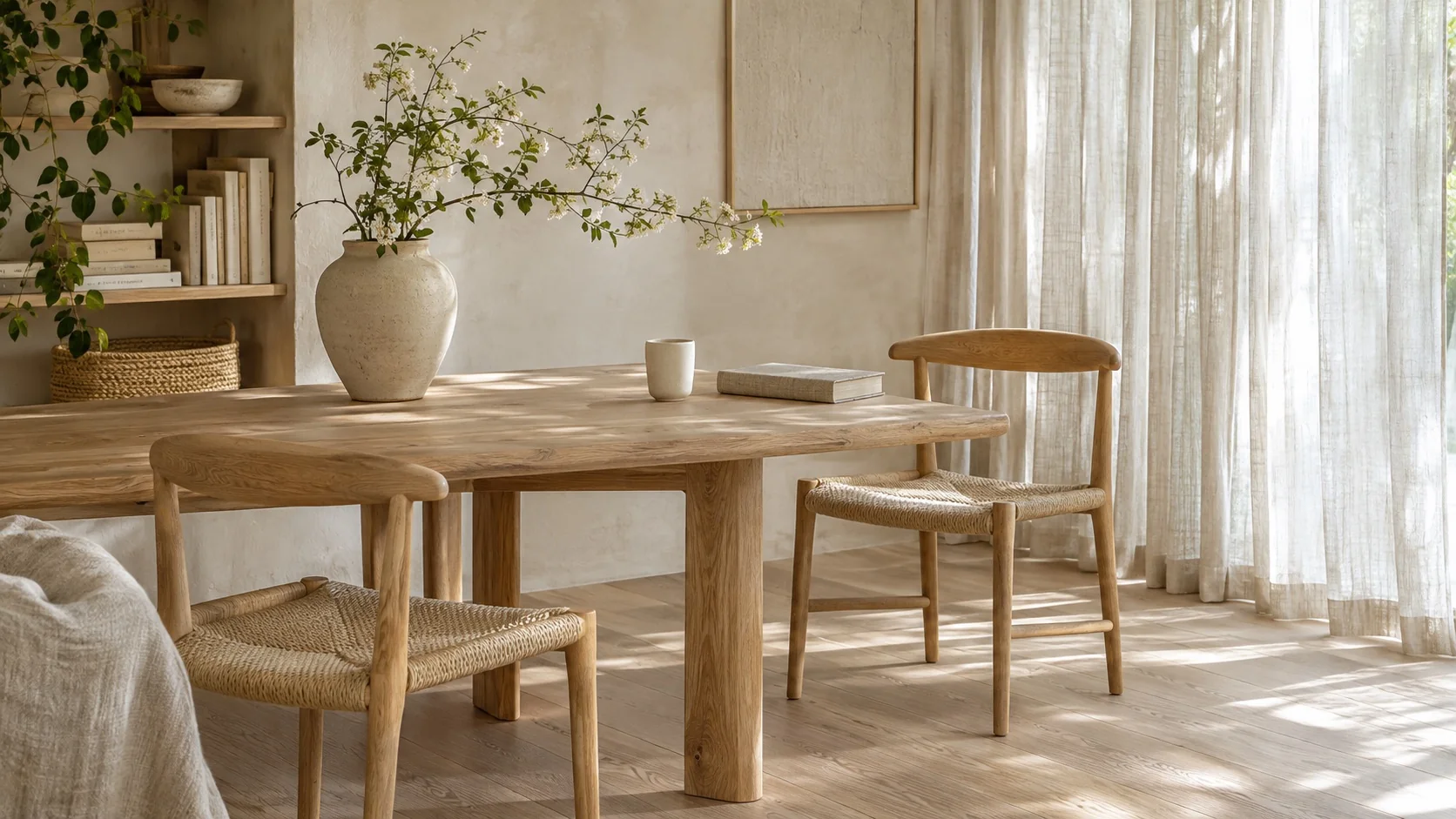
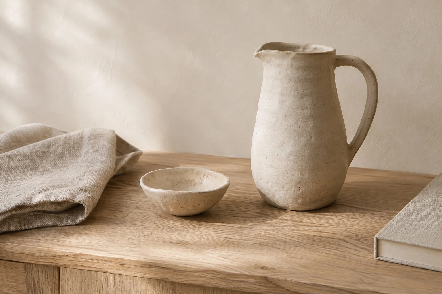
下载 · 白橡木室内照片 · 陶器照片 · Geist 可变字体
@font-face { font-family: 'Geist'; font-style: normal; font-weight: 100 900; font-display: swap; src: url('/fonts/GeistVariable.woff2') format('woff2');}@theme { --color-brand: light-dark(#665442, #d7c2a6); --spacing-story: 1.5rem;}@theme { --font-sans: 'Geist';}@layer components { .journal { font-family: var(--font-family-sans); font-size: 13px; line-height: 1.6; font-weight: 350; } .journal :where(h2, h3, p) { margin: 0; } .journal a { color: inherit; text-decoration: none; } .journal a:hover { text-decoration: underline; text-underline-offset: .2em; } .journal :focus-visible { outline: 2px solid var(--color-brand); outline-offset: 4px; } .journal-head { padding: 20px 24px; border-bottom: 1px solid var(--color-line-subtle); } .journal-brand { font-size: 25px; line-height: 1; font-weight: 500; letter-spacing: -.06em; } .journal-edition { font-size: 10px; letter-spacing: .1em; text-transform: uppercase; } .journal-nav { display: flex; flex-wrap: wrap; gap: 12px 20px; font-size: 12px; } .journal-main { min-width: 0; } .journal-photo { display: block; width: 100%; height: auto; aspect-ratio: 16 / 9; object-fit: cover; border-radius: 4px; outline: 1px solid light-dark(rgb(0 0 0 / .08), rgb(255 255 255 / .08)); outline-offset: -1px; } .journal-kicker { font-size: 11px; line-height: 1.5; letter-spacing: .09em; text-transform: uppercase; } .journal-title { max-width: 12ch; font-size: clamp(28px, 4.8vw, 36px); line-height: 1.08; font-weight: 400; letter-spacing: -.04em; } .journal-deck { max-width: 44ch; font-size: 14px; line-height: 1.7; } .journal-meta { font-size: 11px; line-height: 1.5; } .journal-read { border-top: 1px solid var(--color-line-subtle); padding-top: 4px; } .journal-read > summary { width: fit-content; padding: 10px 0; cursor: pointer; font-size: 13px; } .journal-copy { display: grid; gap: 12px; padding-top: 6px; font-size: 14px; line-height: 1.8; } .journal-aside { min-width: 0; border-top: 1px solid var(--color-line-subtle); } .journal-aside-title { font-size: 23px; line-height: 1.2; letter-spacing: -.03em; font-weight: 400; } .journal-story { border-top: 1px solid var(--color-line-subtle); } .journal-story > summary { display: flex; align-items: start; justify-content: space-between; gap: 12px; padding-block: 20px; cursor: pointer; list-style: none; } .journal-story > summary::-webkit-details-marker { display: none; } .journal-story-title { margin-top: 7px; font-size: 16px; line-height: 1.4; font-weight: 400; letter-spacing: -.015em; } .journal-story-image { display: block; width: 64px; height: 76px; object-fit: cover; border-radius: 3px; } .journal-story-arrow { font-size: 20px; line-height: 1; } .journal-story[open] .journal-story-arrow { transform: rotate(45deg); } .journal-story > p { padding-bottom: 20px; font-size: 13px; line-height: 1.8; } .journal-about { display: grid; gap: 8px; padding: 20px 24px; border-top: 1px solid var(--color-line-subtle); font-size: 12px; line-height: 1.7; } .journal-about p { max-width: 48ch; } @media (width >= 38rem) { .journal-grid { display: grid; grid-template-columns: 1.6fr 1fr; } .journal-aside { border-top: 0; border-left: 1px solid var(--color-line-subtle); } .journal-about { grid-template-columns: 1fr auto; align-items: center; gap: 24px; } } @media (width < 24rem) { .journal-head { padding: 20px; } .journal-edition-label { display: none; } .journal-nav { gap: 16px; } }}<article class="journal r-lg overflow-hidden bg-surface-raised fg-text-body shadow-sm" aria-label="Fieldwork journal"> <header class="journal-head grid gap-md"> <div class="flex flex-wrap items-center justify-between gap-md"> <span class="journal-brand fg-text-strong">Fieldwork<span class="fg-brand">.</span></span> <span class="journal-edition fg-text-muted"><span class="journal-edition-label">An independent journal · </span>Issue 04</span> </div> <nav class="journal-nav fg-text-muted" aria-label="Journal sections"> <a href="#fieldwork-lead">Featured story</a> <a href="#fieldwork-notes">Field notes</a> <a href="#fieldwork-about">About</a> </nav> </header> <div class="journal-grid"> <section id="fieldwork-lead" class="journal-main grid gap-md p-story" aria-labelledby="fieldwork-title"> <img class="journal-photo" src="/images/blog/v2/white-oak-room.webp" alt="White oak chairs and a dining table beside sheer linen curtains" width="1672" height="941" /> <p class="journal-kicker fg-brand">Spaces / Quiet interiors</p> <h2 id="fieldwork-title" class="journal-title fg-text-strong">The everyday, considered.</h2> <p class="journal-deck fg-text-muted">On slowing down, looking closer, and finding a little more in the spaces we inhabit.</p> <p class="journal-meta fg-text-muted">Field note 01 — At home</p> <details class="journal-read"> <summary class="fg-brand">Read the field note</summary> <div class="journal-copy"> <p>Morning light moves across the oak table. A cup, a book, a chair pulled close. The room asks for very little, and gives something back: space to read, to think, to begin again.</p> <p>Its character lives in small decisions. The soft edge of a tabletop. Linen that lets the light through. A place for the objects we reach for every day. Nothing needs to compete for attention.</p> <p>A good home makes room for the everyday.</p> </div> </details> </section> <aside id="fieldwork-notes" class="journal-aside p-story" aria-labelledby="fieldwork-notes-title"> <div class="grid gap-sm pb-lg"> <p class="journal-kicker fg-brand">The art of noticing</p> <h2 id="fieldwork-notes-title" class="journal-aside-title fg-text-strong">Quiet spaces.<br>Everyday rituals.</h2> <p class="journal-deck fg-text-muted">Thoughtful spaces and useful objects. A little less, made with care.</p> </div> <details class="journal-story"> <summary> <span><span class="journal-meta fg-text-muted">02 / Objects</span><span class="journal-story-title block fg-text-strong">Room to make something.</span></span> <img class="journal-story-image" src="/images/blog/v2/ceramic-study.webp" alt="A ceramic pitcher and bowl on a white oak table" width="1536" height="1024" /> </summary> <p>Clay keeps a record of the hand. A slightly uneven rim, a glaze that settles into the surface, a handle shaped to be held. Useful objects can make a daily ritual feel considered.</p> </details> <details class="journal-story"> <summary> <span><span class="journal-meta fg-text-muted">03 / In practice</span><span class="journal-story-title block fg-text-strong">The things we choose to keep.</span></span> <span class="journal-story-arrow fg-text-muted" aria-hidden="true">+</span> </summary> <p>A room takes shape through what stays. Start with the pieces you use, give each one a place, and leave a little space between them. The goal is a home that works for the life inside it.</p> </details> </aside> </div> <footer id="fieldwork-about" class="journal-about fg-text-muted"> <p>Fieldwork is an illustrative journal about thoughtful spaces and everyday rituals, created for the Master CSS 2.0 release.</p> <span>Good spaces. Considered living.</span> </footer></article>生成的 CSS
@font-face { font-family: Geist; font-style: normal; font-weight: 100 900; font-display: swap; src: url("/fonts/GeistVariable.woff2") format("woff2");}@layer components { .journal { font-family: var(--font-family-sans); font-size: 13px; font-weight: 350; line-height: 1.6; } .journal :where(h2, h3, p) { margin: 0; } .journal a { color: inherit; text-decoration: none; } .journal a:hover { text-underline-offset: .2em; text-decoration: underline; } .journal :focus-visible { outline: 2px solid var(--color-brand); outline-offset: 4px; } .journal-head { border-bottom: 1px solid var(--color-line-subtle); padding: 20px 24px; } .journal-brand { letter-spacing: -.06em; font-size: 25px; font-weight: 500; line-height: 1; } .journal-edition { letter-spacing: .1em; text-transform: uppercase; font-size: 10px; } .journal-nav { flex-wrap: wrap; gap: 12px 20px; font-size: 12px; display: flex; } .journal-main { min-width: 0; } .journal-photo { aspect-ratio: 16 / 9; object-fit: cover; outline-offset: -1px; border-radius: 4px; outline: 1px solid light-dark(#00000014, #ffffff14); width: 100%; height: auto; display: block; } .journal-kicker { letter-spacing: .09em; text-transform: uppercase; font-size: 11px; line-height: 1.5; } .journal-title { letter-spacing: -.04em; max-width: 12ch; font-size: clamp(28px, 4.8vw, 36px); font-weight: 400; line-height: 1.08; } .journal-deck { max-width: 44ch; font-size: 14px; line-height: 1.7; } .journal-meta { font-size: 11px; line-height: 1.5; } .journal-read { border-top: 1px solid var(--color-line-subtle); padding-top: 4px; } .journal-read > summary { cursor: pointer; width: fit-content; padding: 10px 0; font-size: 13px; } .journal-copy { gap: 12px; padding-top: 6px; font-size: 14px; line-height: 1.8; display: grid; } .journal-aside { border-top: 1px solid var(--color-line-subtle); min-width: 0; } .journal-aside-title { letter-spacing: -.03em; font-size: 23px; font-weight: 400; line-height: 1.2; } .journal-story { border-top: 1px solid var(--color-line-subtle); } .journal-story > summary { cursor: pointer; justify-content: space-between; align-items: start; gap: 12px; padding-block: 20px; list-style: none; display: flex; } .journal-story > summary::-webkit-details-marker { display: none; } .journal-story-title { letter-spacing: -.015em; margin-top: 7px; font-size: 16px; font-weight: 400; line-height: 1.4; } .journal-story-image { object-fit: cover; border-radius: 3px; width: 64px; height: 76px; display: block; } .journal-story-arrow { font-size: 20px; line-height: 1; } .journal-story[open] .journal-story-arrow { transform: rotate(45deg); } .journal-story > p { padding-bottom: 20px; font-size: 13px; line-height: 1.8; } .journal-about { border-top: 1px solid var(--color-line-subtle); gap: 8px; padding: 20px 24px; font-size: 12px; line-height: 1.7; display: grid; } .journal-about p { max-width: 48ch; } @media (width >= 38rem) { .journal-grid { grid-template-columns: 1.6fr 1fr; display: grid; } .journal-aside { border-top: 0; border-left: 1px solid var(--color-line-subtle); } .journal-about { grid-template-columns: 1fr auto; align-items: center; gap: 24px; } } @media (width < 24rem) { .journal-head { padding: 20px; } .journal-edition-label { display: none; } .journal-nav { gap: 16px; } }}@layer theme { :root, :host { --color-zinc-30: oklch(78% .0025 265); --color-zinc-40: oklch(68.6% .0028 265); --color-zinc-60: oklch(48.6% .003 265); --color-zinc-70: oklch(39.8% .0028 265); --color-zinc-90: oklch(24.6% .0022 265); --color-zinc-100: oklch(15% .0016 265) } :root, :host { --color-surface-raised: light-dark(var(--color-white), var(--color-zinc-90)); --color-line-subtle: light-dark(oklch(0% 0 none / .06), oklch(100% 0 none / .06)); --color-text-body: light-dark(var(--color-zinc-70), var(--color-zinc-30)); --color-text-strong: light-dark(var(--color-zinc-100), var(--color-white)); --color-text-muted: light-dark(var(--color-zinc-60), var(--color-zinc-40)) } :root, :host { --color-white: oklch(100% 0 none) } :root, :host { --font-family-sans: var(--font-sans, ui-sans-serif), system-ui, -apple-system, BlinkMacSystemFont, "Segoe UI", Roboto, "Helvetica Neue", Arial, "Noto Sans", sans-serif, "Apple Color Emoji", "Segoe UI Emoji", "Segoe UI Symbol", "Noto Color Emoji"; --radius-lg: .5rem; --spacing-sm: .75rem; --spacing-md: 1rem; --spacing-lg: 1.5rem } :root, :host { --shadow-sm: 0 0 0 1px light-dark(oklch(0% 0 none / .04), oklch(100% 0 none / .05)), 0 1px 1px -.5px light-dark(oklch(0% 0 none / .045), oklch(0% 0 none / .3)), 0 2px 2px -1px light-dark(oklch(0% 0 none / .04), oklch(0% 0 none / .26)), 0 4px 4px -2px light-dark(oklch(0% 0 none / .04), oklch(0% 0 none / .24)) } :root, :host { --color-brand: light-dark(#665442, #d7c2a6); --spacing-story: 1.5rem } :root, :host { --font-sans: "Geist" }}@layer utilities { .items-center { align-items: center } .bg-surface-raised { background-color: var(--color-surface-raised) } .r-lg { border-radius: var(--radius-lg) } .shadow-sm { box-shadow: var(--shadow-sm) } .fg-brand { color: var(--color-brand) } .fg-text-body { color: var(--color-text-body) } .fg-text-muted { color: var(--color-text-muted) } .fg-text-strong { color: var(--color-text-strong) } .block { display: block } .flex { display: flex } .grid { display: grid } .flex-wrap { flex-wrap: wrap } .gap-md { gap: var(--spacing-md) } .gap-sm { gap: var(--spacing-sm) } .justify-between { justify-content: space-between } .overflow-hidden { overflow: hidden } .p-story { padding: var(--spacing-story) } .pb-lg { padding-bottom: var(--spacing-lg) }}缩窄预览,侧栏就会并入正文的阅读顺序。打开一篇文章,布局会为它腾出空间。切换主题时,强调色会变,共用间距让布局保持一致。你可以在预览中查看 HTML 和 CSS。
#用一个类名表达更多
Master CSS 让样式决策写在元素旁边。用 flex 和 grid 布局,用 gap-md 和 p-lg 引用项目令牌,把选择器和条件接在它们所修饰的类名后面。
<a class="inline-flex px-md py-xs r-md fg-blue-60 fg-blue-70:hover@sm" href="/journal"> Read the journal</a>从左到右读 fg-blue-70:hover@sm,就是在达到 sm 断点且鼠标悬停时使用 blue-70 颜色令牌。预设中的断点阈值为 52.125rem。Master CSS 负责生成规则,浏览器负责判断选择器和媒体查询是否匹配。
一个类名写清样式和条件
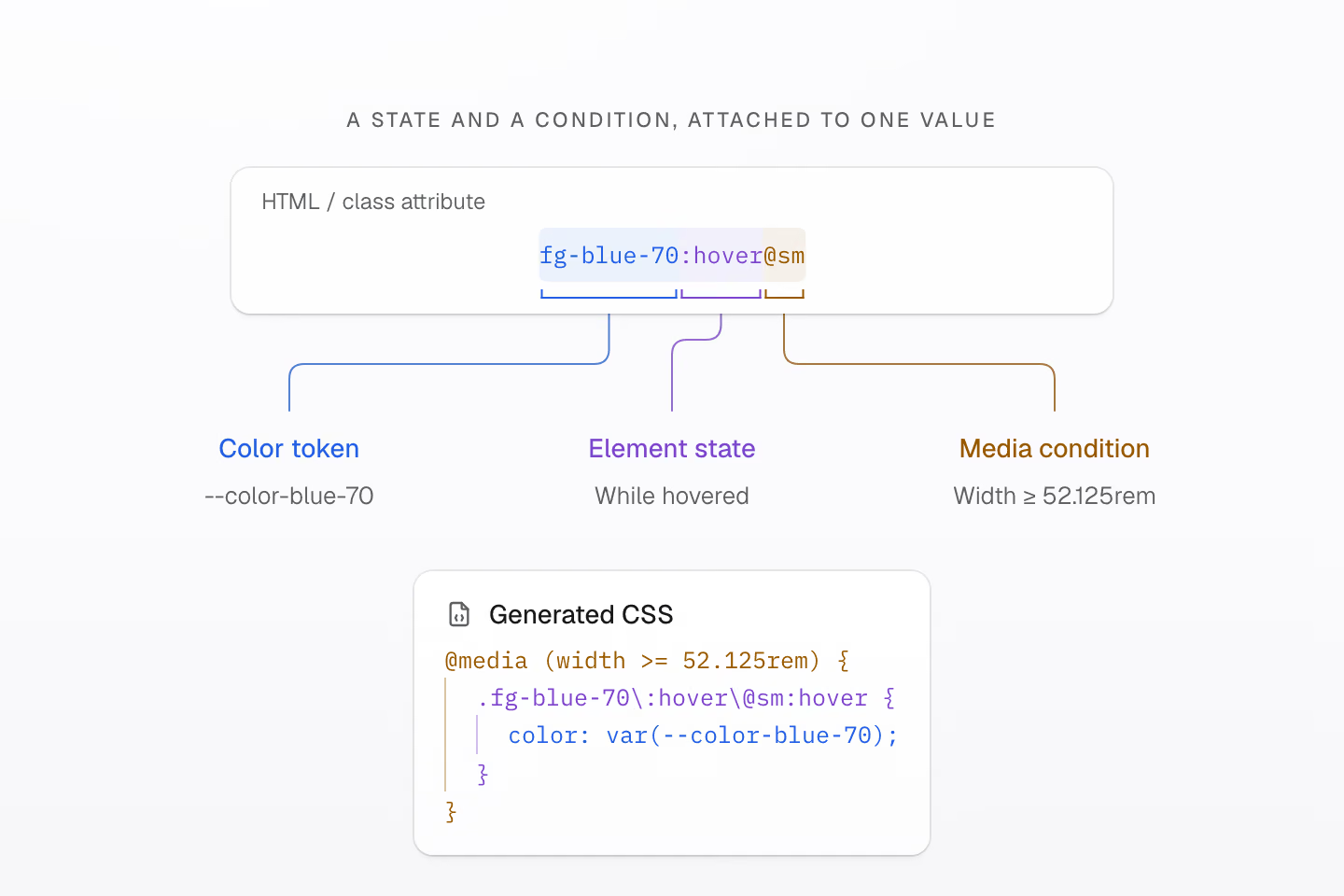
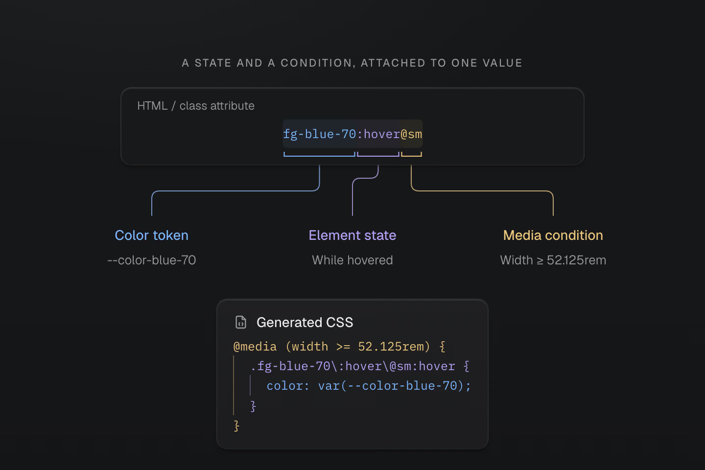
类名把值、选择器和条件写在一起。浏览器判断生成的选择器和媒体查询是否匹配。
文字说明
- fg-blue-70 生成 color: var(--color-blue-70)。:hover 为带这个类名的元素加上悬停条件。
- @sm 使用预设的媒体条件 (width >= 52.125rem)。媒体查询和悬停状态都必须匹配。
根据需要选择写法。
| 类名 | 含义 |
|---|---|
p-lg | 使用 --spacing-lg 令牌设置内边距。 |
m(0) | 外边距为零。 |
p(16) | 内边距为 16px。 |
grow(1) | Flex 增长因子为 1,无单位。 |
grid-cols(3) | 三列等宽网格。 |
(aspect-ratio:4/3) | 直接使用原生 CSS 属性和值。 |
数值函数的参数取决于对应的属性。p(16) 表示长度,grow(1) 的参数没有单位。原生声明也接受 CSS 函数和自定义属性。用 (width:var(--progress)) 时,JavaScript 可以更新属性值,类名保持不变。
更多类名组合方式
| 类名 | 含义 |
|---|---|
fg-blue-60/.5 · -mt-sm | 颜色不透明度为 50%,或使用间距令牌的负值。 |
fg-blue-60:hover>a · fg-blue-60_a | 选中悬停元素的直接子链接,或选中其后代链接。 |
grid@supports(display:grid) | 用原生特性查询包裹规则。 |
(opacity:0)@starting-style | CSS 过渡的初始不透明度。 |
p-md! | 带重要性标记的内边距声明。 |
:focus-visible、:has() 和 ::before 等选择器可以与 @media(...)、@supports(...) 和 @container(...) 组合。多个条件会嵌套,每个条件都要满足。生成结果是可以直接查看的普通 CSS。
想动手试试,可以从语法教程开始。
#建立自己的设计系统
先用预设的颜色、间距、字体排版、圆角、阴影和动效令牌。界面的风格逐渐成形后,用 @theme 给这些设计选择命名。
#宽色域调色板
调色板有 17 个色系,每个色系有 11 个色阶。预设使用 OKLCH 表示颜色,其中一些颜色超出 sRGB,进入 Display P3 色域。每列由浅到深排列,实际能看到的颜色范围取决于你的显示器。
你可以直接用 fg-blue-50 或 bg-green-90 这样的色阶,也可以为用途定义语义化名称。Fieldwork 共用一套强调色和文章内边距。在应用样式表的 @import '@master/css' 后加入下面的定义。
为一篇随笔换上自己的配色
@theme { --color-brand: light-dark(#665442, #d7c2a6); --spacing-story: 1.5rem;}<article class="max-w-sm mx-auto overflow-hidden r-lg bg-surface-raised shadow-sm"> <div class="grid gap-sm p-story"> <p class="m(0) text-xs fg-brand">Fieldwork / Issue 04</p> <h2 class="m(0) text-2xl font-regular fg-text-strong">The everyday, considered.</h2> <p class="m(0) text-sm fg-text-muted">A field note on slowing down, looking closer, and finding a little more in the spaces we inhabit.</p> <details class="text-sm"> <summary class="(cursor:pointer) fg-brand py-xs">Read the field note</summary> <p class="m(0) pt-sm fg-text-body">Morning light moves across the oak table. A cup, a book, a chair pulled close. The room asks for very little, and gives something back: space to read, to think, to begin again. A good home makes room for the everyday.</p> </details> </div></article>生成的 CSS
@layer theme { :root, :host { --color-zinc-30: oklch(78% .0025 265); --color-zinc-40: oklch(68.6% .0028 265); --color-zinc-60: oklch(48.6% .003 265); --color-zinc-70: oklch(39.8% .0028 265); --color-zinc-90: oklch(24.6% .0022 265); --color-zinc-100: oklch(15% .0016 265) } :root, :host { --color-surface-raised: light-dark(var(--color-white), var(--color-zinc-90)); --color-text-body: light-dark(var(--color-zinc-70), var(--color-zinc-30)); --color-text-strong: light-dark(var(--color-zinc-100), var(--color-white)); --color-text-muted: light-dark(var(--color-zinc-60), var(--color-zinc-40)) } :root, :host { --color-white: oklch(100% 0 none) } :root, :host { --font-weight-regular: 400; --font-size-xs: .75rem; --font-size-sm: .875rem; --font-size-2xl: 1.5rem; --text-xs: var(--font-size-xs); --text-xs--line-height: 1.5; --text-xs--letter-spacing: 0; --text-sm: var(--font-size-sm); --text-sm--line-height: 1.5; --text-sm--letter-spacing: 0; --text-2xl: var(--font-size-2xl); --text-2xl--line-height: 1.35; --text-2xl--letter-spacing: -.015em; --radius-lg: .5rem; --spacing-xs: .5rem; --spacing-sm: .75rem; --container-sm: 24rem } :root, :host { --shadow-sm: 0 0 0 1px light-dark(oklch(0% 0 none / .04), oklch(100% 0 none / .05)), 0 1px 1px -.5px light-dark(oklch(0% 0 none / .045), oklch(0% 0 none / .3)), 0 2px 2px -1px light-dark(oklch(0% 0 none / .04), oklch(0% 0 none / .26)), 0 4px 4px -2px light-dark(oklch(0% 0 none / .04), oklch(0% 0 none / .24)) } :root, :host { --color-brand: light-dark(#665442, #d7c2a6); --spacing-story: 1.5rem }}@layer utilities { .text-2xl { font-size: var(--text-2xl); line-height: var(--text-2xl--line-height, normal); letter-spacing: var(--text-2xl--letter-spacing, normal) } .text-sm { font-size: var(--text-sm); line-height: var(--text-sm--line-height, normal); letter-spacing: var(--text-sm--letter-spacing, normal) } .text-xs { font-size: var(--text-xs); line-height: var(--text-xs--line-height, normal); letter-spacing: var(--text-xs--letter-spacing, normal) } .bg-surface-raised { background-color: var(--color-surface-raised) } .r-lg { border-radius: var(--radius-lg) } .shadow-sm { box-shadow: var(--shadow-sm) } .fg-brand { color: var(--color-brand) } .fg-text-body { color: var(--color-text-body) } .fg-text-muted { color: var(--color-text-muted) } .fg-text-strong { color: var(--color-text-strong) } .grid { display: grid } .font-regular { font-weight: var(--font-weight-regular) } .gap-sm { gap: var(--spacing-sm) } .m\(0\) { margin: calc(0 * 1px) } .mx-auto { margin-inline: auto } .max-w-sm { max-width: var(--container-sm) } .overflow-hidden { overflow: hidden } .p-story { padding: var(--spacing-story) } .py-xs { padding-block: var(--spacing-xs) } .pt-sm { padding-top: var(--spacing-sm) } .\(cursor\:pointer\) { cursor: pointer }}fg-brand 读取 --color-brand,p-story 读取 --spacing-story。修改一个令牌,所有使用它的元素都会更新。下面两张卡片在不同配色方案下使用不同的强调色,内边距都保持 1.5rem。
共用令牌,两种配色方案
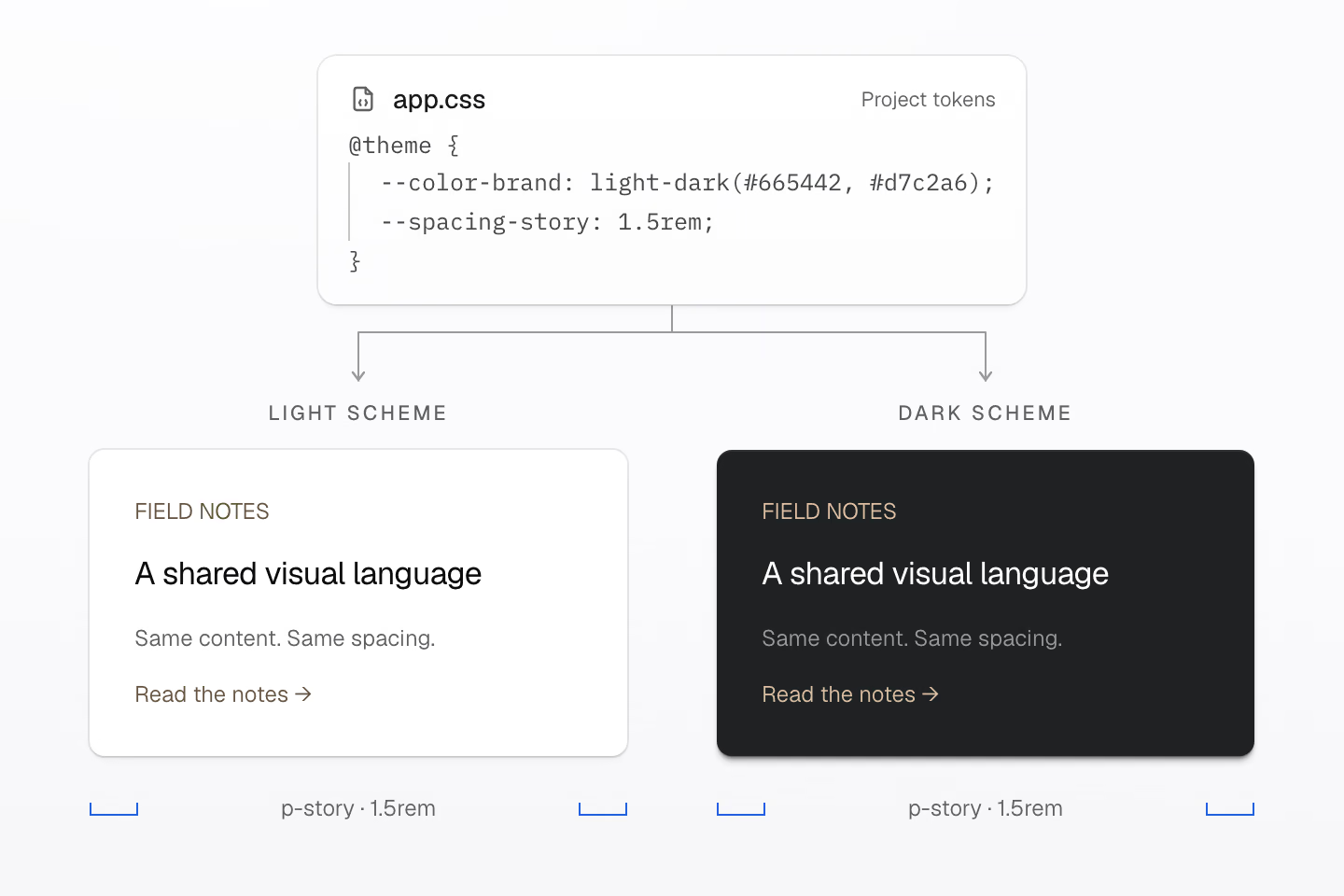
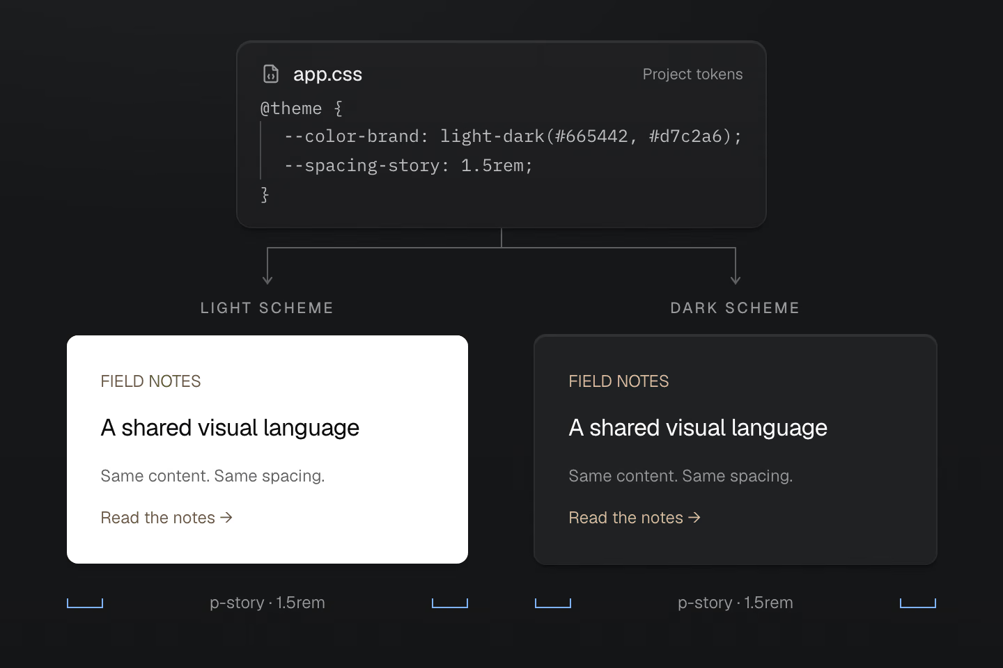
两张卡片使用同一套标记。原生 light-dark() 负责选择强调色,测量标尺显示 p-story 为两张卡片提供相同的 1.5rem 内容内边距。
文字说明
- 样式表把 --color-brand 定义为 light-dark(#665442, #d7c2a6),把 --spacing-story 定义为 1.5rem。
- 两张纯文本卡片都使用 fg-brand 和 p-story。浅色卡片使用第一个强调色,深色卡片使用第二个。两张卡片的文字、布局和 1.5rem 内边距都相同。
原生 light-dark() 根据当前的 color-scheme 选择强调色。预设中的语义化表面颜色和文字颜色也会跟随配色方案。给应当一起变化的设计选择命名。 数值眼下相同,未必就应该共用一个令牌。
#为响应式条件命名
用 @custom-media 为视口条件命名,用 @custom-container 为容器条件命名。
@custom-media --reading (width >= 60rem);@custom-container --story-wide (width >=28rem);<section class="container-inline (container-name:story)"> <article class="grid gap-md p-md p-lg@reading grid-cols(2)@container(story_--story-wide)"> <h2 class="m(0)">A layout that knows its space</h2> <p class="m(0)">Two columns when this container has room.</p> </article></section>生成的 CSS
@layer theme { :root, :host { --spacing-md: 1rem; --spacing-lg: 1.5rem }}@layer utilities { .container-inline { container-type: inline-size } .grid { display: grid } .gap-md { gap: var(--spacing-md) } .m\(0\) { margin: calc(0 * 1px) } .p-md { padding: var(--spacing-md) } .\(container-name\:story\) { container-name: story } @container story (width >= 28rem) { .grid-cols\(2\)\@container\(story_--story-wide\) { display: grid; grid-template-columns: repeat(2, minmax(0, 1fr)) } } @media (width >= 60rem) { .p-lg\@reading { padding: var(--spacing-lg) } }}p-lg@reading 随视口变化,grid-cols(2)@container(story_--story-wide) 则取决于父级中名为 story 的容器。前者响应页面宽度,后者响应组件可用空间。在类名中,_ 表示值或查询中的空格,因此 @container(story_--story-wide) 会以 --story-wide 判断 story 容器;字面下划线写作 \_。在应用样式表中,可以将相同的条件写成 @media (--reading) 和 @container story (--story-wide)。Master CSS 会把两种写法都展开成普通 CSS 查询。
#用原生 CSS 复用样式
文章链接、导航项或对话框都可以有自己的 CSS。预设定义了五个层叠层,依次是 theme、base、defaults、components 和 utilities。把共用样式放进 components,再用工具类做局部调整。
@layer components { .story-link { display: inline-flex; padding-inline: 1rem; padding-block: 0.5rem; border-radius: 0.375rem; background-color: var(--color-surface-raised); color: var(--color-text-body); text-decoration: none; }}<a class="story-link" href="/journal">Read the journal</a><a class="story-link px-lg" href="/journal">Read the journal</a>生成的 CSS
@layer components { .story-link { background-color: var(--color-surface-raised); color: var(--color-text-body); border-radius: .375rem; padding-block: .5rem; padding-inline: 1rem; text-decoration: none; display: inline-flex; }}@layer theme { :root, :host { --color-zinc-30: oklch(78% .0025 265); --color-zinc-70: oklch(39.8% .0028 265); --color-zinc-90: oklch(24.6% .0022 265) } :root, :host { --color-surface-raised: light-dark(var(--color-white), var(--color-zinc-90)); --color-text-body: light-dark(var(--color-zinc-70), var(--color-zinc-30)) } :root, :host { --color-white: oklch(100% 0 none) } :root, :host { --spacing-lg: 1.5rem }}@layer utilities { .px-lg { padding-inline: var(--spacing-lg) }}两个链接都使用 .story-link。第二个链接加了 px-lg,水平内边距从 1rem 增加到 1.5rem。对于普通声明,排在后面的 utilities 层优先于 components。
共用组件,局部调整
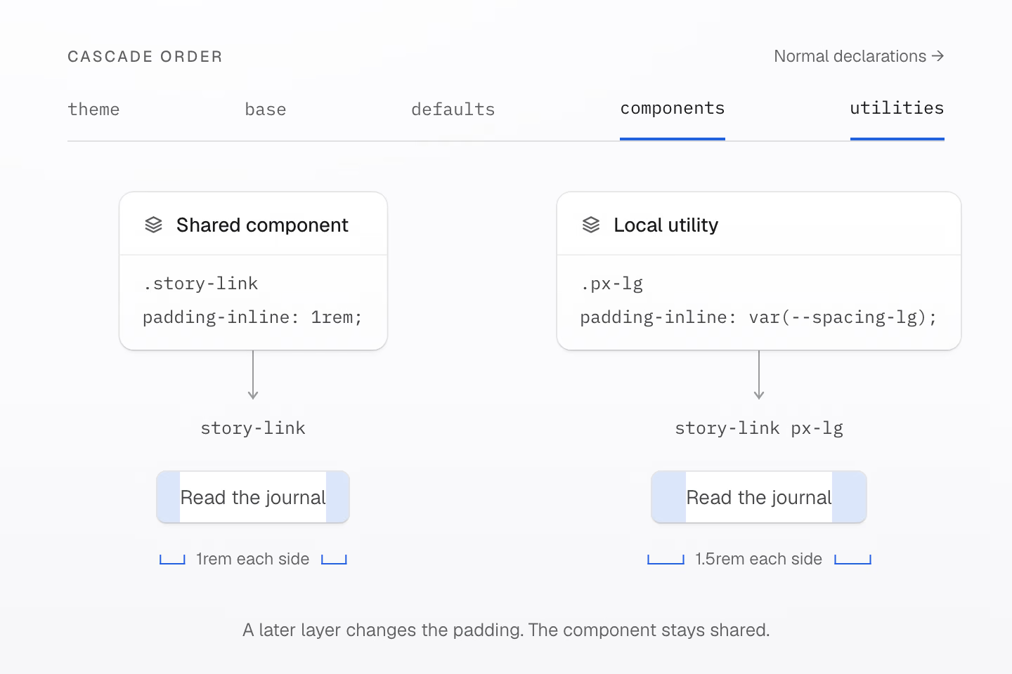
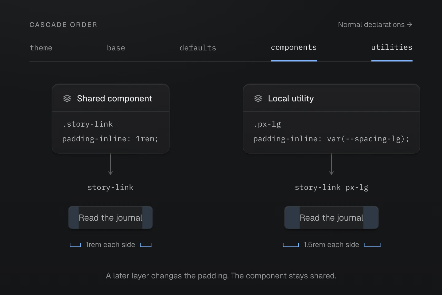
在这些层的普通声明中,utilities 优先于 components。蓝色带用于标出内边距。
文字说明
- .story-link 组件在 components 层定义 1rem 的水平内边距。两个链接共用它的外形和字体样式。
- 第二个链接添加 utilities 层的 px-lg。左右内边距变为各 1.5rem,链接文字保持不变。
#按需选择复用方式
根据要共用的内容选择工具。
| 共用内容 | 写法 |
|---|---|
| 设计值 | @theme 中的令牌。 |
| 组件样式 | @layer components 中的原生类。 |
| 按需生成的类名 | @utility 定义。 |
| 声明和条件 | 用 @apply 展开 @mixin 定义。 |
混入本身不会创建类名。这里的 --action-row 为原生组件和按需生成的工具类提供相同的声明。
@mixin --action-row { display: inline-flex; align-items: center; gap: var(--spacing-xs);}@utility action-row { @apply --action-row;}@mixin --hocus { &:is(:hover, :focus-visible) { @contents; }}@layer components { .story-action { @apply --action-row; }}<a class="story-action underline@apply(--hocus)" href="/journal">Read a story</a><a class="action-row underline@apply(--hocus)" href="/archive">Browse the archive</a>生成的 CSS
@layer components { .story-action { display: inline-flex; align-items: center; gap: var(--spacing-xs) }}@layer theme { :root, :host { --spacing-xs: .5rem }}@layer utilities { .action-row { display: inline-flex; align-items: center; gap: var(--spacing-xs) } .underline\@apply\(--hocus\):is(:hover, :focus-visible) { text-decoration-line: underline }}--hocus 共用悬停和键盘焦点的选择器。underline@apply(--hocus) 生成的下划线声明会填入它的 @contents 插槽。@apply 接受混入调用,不接受工具类列表。 Master CSS 会在编译时处理它支持的静态混入语法,浏览器无需原生支持 CSS 混入。
自定义工具类还可以接受静态参数,或将令牌命名空间关联到一组类名。编译器和开发工具会同时识别这些项目定义和预设定义。
复用样式介绍这些写法,层叠层解释优先顺序,包括重要声明和未分层样式的行为。
#选择 CSS 的交付方式
根据应用何时能确定类名来选择渲染模式。
静态渲染是默认模式。 构建时扫描完整类名,生成并交付样式表。浏览器无需 Master CSS 运行时。
预渲染模式(prerender)将生成的 CSS 随 HTML 一起交付。 如果集成能读取渲染完成的 HTML,且其中包含页面需要的所有类名,就可以使用这种模式。浏览器无需 Master CSS 运行时。
运行时渲染在浏览器中生成 CSS。 如果编辑器、演练场或部署后提供的内容会引入构建时未知的类名,就可以使用这种模式。运行时渲染和渐进式渲染都会向浏览器交付 JavaScript。
渐进式渲染从已渲染的 HTML 开始。 先交付初始 CSS,之后出现尚未覆盖的类名时,再在浏览器中生成规则。预渲染 CSS 和页面 hydration 清单都有效时,默认运行时可以推迟到这时才加载引擎。
同一套写法,四种 CSS 交付方式
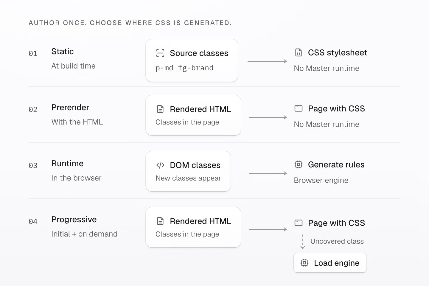
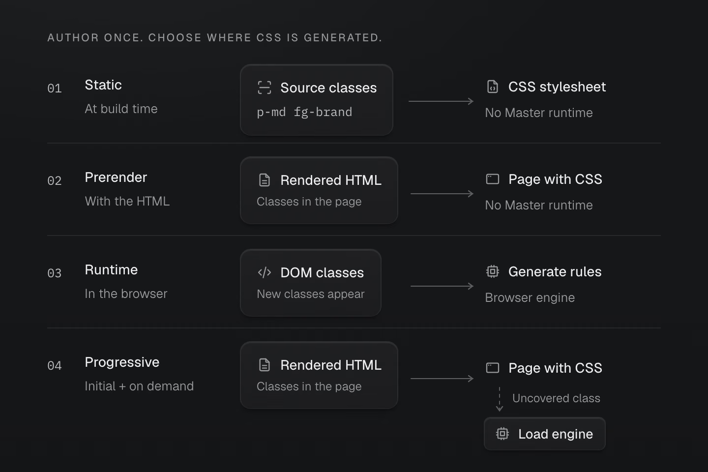
每条路径都可独立使用。渐进式模式在 hydration 数据有效时可以延迟加载引擎。
文字说明
- 静态渲染在构建时扫描源码中的完整类名。浏览器收到 CSS 样式表,无需 Master CSS 运行时。
- 预渲染模式根据已渲染的 HTML 生成初始 CSS,并随 HTML 一起交付。无需加载 Master CSS 运行时。
- 运行时渲染根据已连接到 DOM 的类名在浏览器中生成 CSS。这种方式支持后来引入的类名,需要浏览器执行 JavaScript。
- 渐进式渲染通过已渲染的 HTML 提供初始 CSS。样式表和页面清单有效时,默认运行时会在出现尚未覆盖的类名后加载引擎。
Fieldwork 可以使用静态渲染,同时展开文章、响应媒体查询和切换主题。这些交互本身无需在运行时生成 CSS。
渲染模式的适用边界
CLI 和 Vite 的生产构建会将符合条件的本地导入合并到生成的 CSS 中。请部署完整的资源集,确保保留的样式表、字体和图片也能加载。
Next.js 渐进式适配器处理构建时生成的 HTML。在这种模式下,请求时动态生成的 SSR 响应依赖浏览器运行时来生成 CSS。
源码扫描不会求值任意字符串插值。有关适配器边界和响应的检查方法,请参阅渲染模式。
核心语义由 Rust 实现。浏览器中的 JavaScript 引擎执行编译后的程序,并与 Rust 对比,验证输出一致。
控制扫描、共享定义和裁剪
| 指令 | 用途 |
|---|---|
@source / @source not | 添加或排除要扫描的源文件。 |
@safelist / @blocklist | 保留或排除候选类名。 |
@reference | 共享定义,无需导入引用文件中的原生 CSS。 |
@prune native | 让文件中的原生样式和受管理的关键帧可以在构建提供类名使用信息时被裁剪。 |
原生样式默认保留。扫描与裁剪介绍如何明确设置这些边界。
#测量实际交付的 CSS
在 v2.0.0 的生产构建中,Master CSS 指南的行内样式和链接样式表合计 24.5 kB(Brotli 压缩)· 110.4 kB(未压缩)。其中大部分来自链接的文件,包括站点自身的组件样式。该页面生成的 style#master-css 样式块在压缩前占 833 字节。
文档页面交付的 CSS
7 个文档页面 · CSS 大小以 kB 为单位
 Master CSS
 Angular
 Vue.js
 Material UI
 Bootstrap
 Next.js
 Tailwind CSSAngularMaster CSSMaterial UIBootstrapVue.jsTailwind CSSNext.js
每个页面的设计、内容和构建流程都不同。图表统计初始 HTML 中的行内样式和链接的样式表,测量范围仅限这些 CSS 内容的大小。要比较同等条件下的输出,请参阅用 Master CSS 和 Tailwind CSS 构建相同界面。
#让开发工具读取项目定义
语言服务会读取你的项目定义。你可以在编辑器中补全令牌名称,悬停查看生成的 CSS,以及处理颜色。自定义工具类和令牌也可以用于这些操作。
#一眼看清类名结构
VS Code 扩展默认使用 active 模式,语义高亮会跟随光标所在的类名。值、选择器、查询、单位和重要性标记各有区分,周围的标记保持原有样式。
看清类名的各个部分
<h2 class="m(0) text-lg">Field notes</h2><a class="fg-blue-70:hover@sm" href="/journal"> Read the journal</a>将指针移到类名值上,或按 Tab 聚焦,即可查看语法配色。触屏设备直接显示配色。网页示例使用 Master CSS 语义分析,VS Code 中的高亮跟随编辑器光标。
颜色分别标出了什么
第一组类名包含数值函数 m(0) 和基于令牌的工具类 text-lg。第二组组合了 fg-blue-70、:hover 选择器和 @sm 媒体条件。高亮用颜色区分这些部分,生成的 CSS 保持不变。
选择编辑器高亮模式
将 masterCSS.embeddedSyntaxHighlighting 设为 active,可高亮光标所在的类名。设为 always,可高亮检测到的所有内嵌工具类。设为 off,则关闭内嵌工具类的高亮。CSS 指令语法仍然会高亮。当前的 VS Code 主题必须启用语义高亮。
#用代码检查发现问题
ESLint 集成会根据项目定义检查类名。推荐配置启用以下四条规则,规则名统一以 @master/css/ 开头。
| 规则 | 用途 |
|---|---|
sort-classes | 统一类名顺序并删除重复项。 |
no-invalid-classes | 找出语法错误和生成的无效 CSS。 |
no-conflicting-classes | 报告同一变体作用域内重叠的声明。 |
prefer-canonical-classes | 优先使用含义和顺序等效的规范写法。 |
另有两条规则需要显式启用。
| 规则 | 团队约定 |
|---|---|
no-unapproved-raw-values | 对由令牌驱动的类名,要求使用令牌或明确允许的原始值。 |
prefer-component-classes | 一组类名带组合选择器且数量较多时,建议提取为组件。 |
自动修复可处理排序、规范写法替换和被完全覆盖的类名。默认忽略未知类名。原始值和组件相关的规则需要由作者判断如何处理。
找出冲突并安全修复
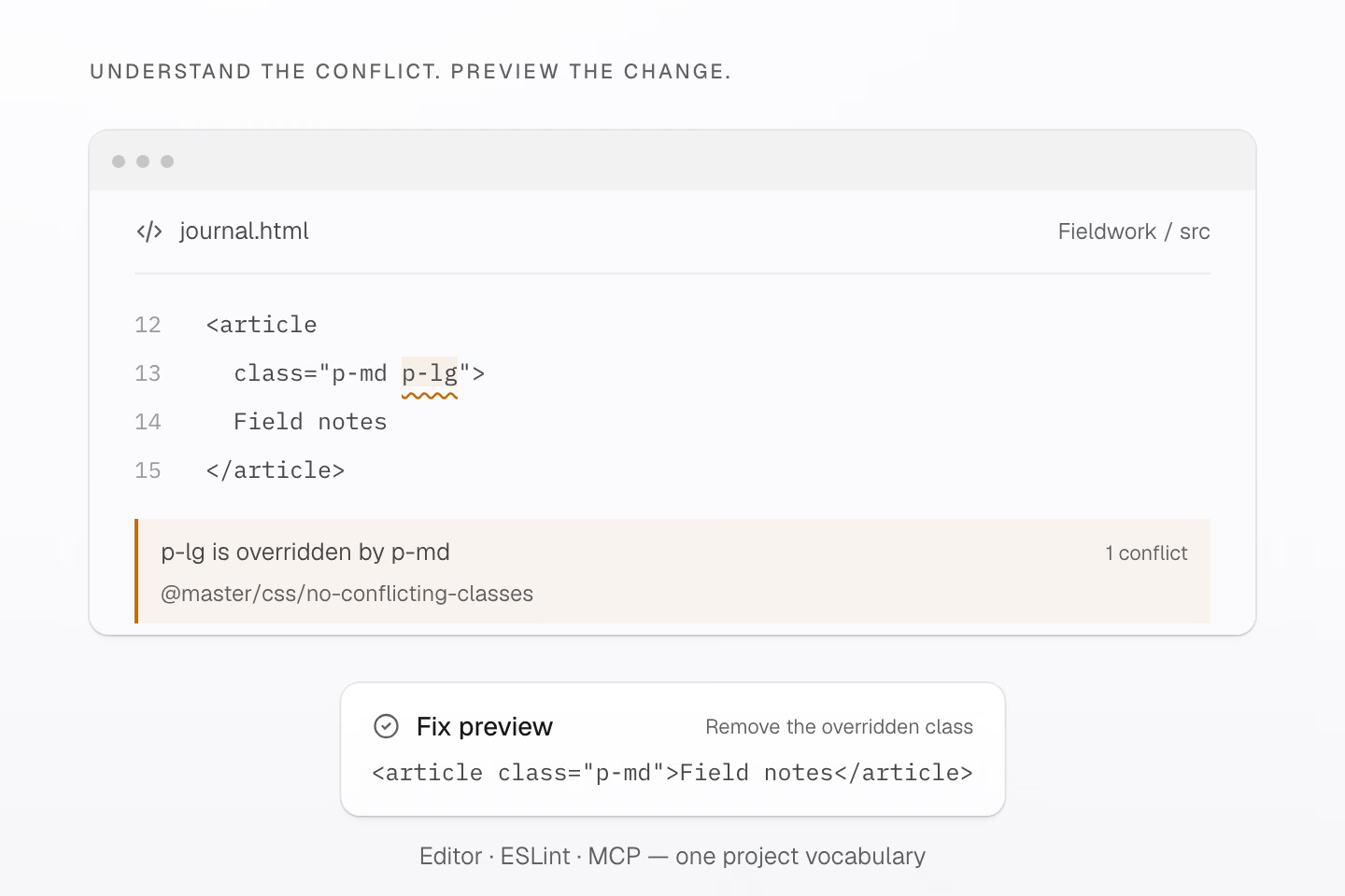
生成的 CSS 中,p-md 的声明优先。安全修复会删除 p-lg 并保留原有效果。
文字说明
- 对于 <article class="p-md p-lg">Field notes</article>,冲突诊断提示删除类名 p-lg,因为它在生成的 CSS 中被 p-md 覆盖。
- 安全修复的结果是 <article class="p-md">Field notes</article>。编辑器、代码检查工具和 MCP 都使用项目解析后的定义。应用预览中的修复时,还会核对源文件哈希。
对 p-md p-lg,工具会报告 p-lg 被覆盖并保留 p-md。HTML 中类名的顺序不决定 CSS 优先级。 声明只部分重叠时,仍需要人工审查。代码检查通过后,仍需验证浏览器支持和显示效果。配置方式和规则选项请参阅代码检查。
#把项目上下文提供给 AI
本地 Master CSS MCP 服务器让编程代理也能读取这些项目定义。它可以查询令牌和工具类、查看生成的 CSS、运行代码检查并预览修复。应用预览中的修复时,服务器会核对相关文件是否仍与生成预览时的源文件一致。
让不同 AI 工具使用项目定义
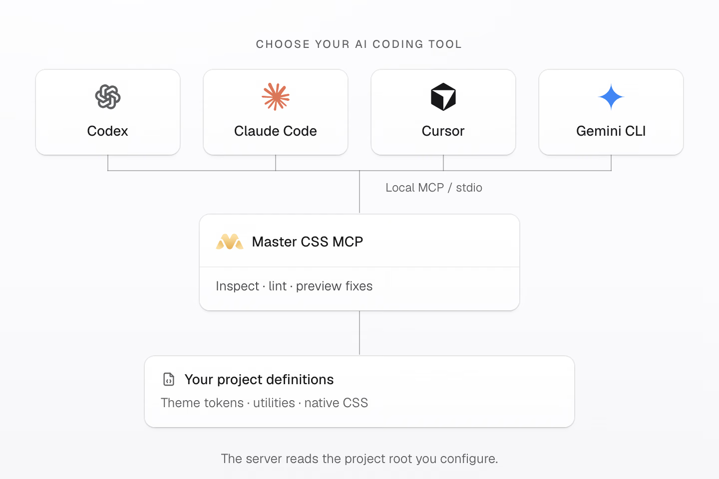
通过本地 stdio 连接 AI 客户端。服务器会读取你配置的项目根目录。
文字说明
- Codex、Claude Code、Cursor 和 Gemini CLI 都可以作为 MCP 客户端。配置 Master CSS 服务器时,指定各客户端要检查的项目根目录。
- Master CSS MCP 可根据加载的项目上下文查询清单、查看生成的 CSS、提供代码检查诊断并预览修复。
- 主题令牌、工具类和原生 CSS 都保存在项目中。应用预览中的修复时会核对源文件哈希,工具权限由客户端管理。
连接支持本地 stdio MCP 的客户端,例如 Codex、Claude Code、Cursor 或 Gemini CLI。配置项目根目录并确认加载的工作区,工具权限由客户端管理。
参阅语言服务和 AI 编程工作流,让编辑器和编程代理都能使用项目定义。
#做出自己的风格
从一个组件开始。给它加一个状态,为一个共用值命名,再看看生成的结果。等遇到下一个实际需求,再决定哪些样式值得复用。
感谢每一位测试 Master CSS、报告问题或分享作品的人。2.0 的成形离不开你们的参与。
安装 Master CSS,跟着语法教程做出第一个界面。
如果 Master CSS 对你有帮助,欢迎在 GitHub 上给它一颗星,让更多开发者发现它。