





用 CSS 寫出自己的設計語言。 Master CSS 2.0 把可組合的 class、專案 token 和可重用的樣式接上同一套工具。用一個 class 描述響應式狀態,在樣式表裡定義主題,開發時隨手檢查生成的 CSS。
 觀看影片: Master CSS 2.0 — Your project, understood.
本頁內容
來看看 Fieldwork,一份用這套方法做成的小刊物。
把構想做成網頁
查看 HTML 和 CSS
在應用的樣式表中,把 CSS 加在 @import '@master/css' 後面。依原始碼所示路徑放置素材,或將 HTML 和 @font-face 的 URL 換成自己的位置。
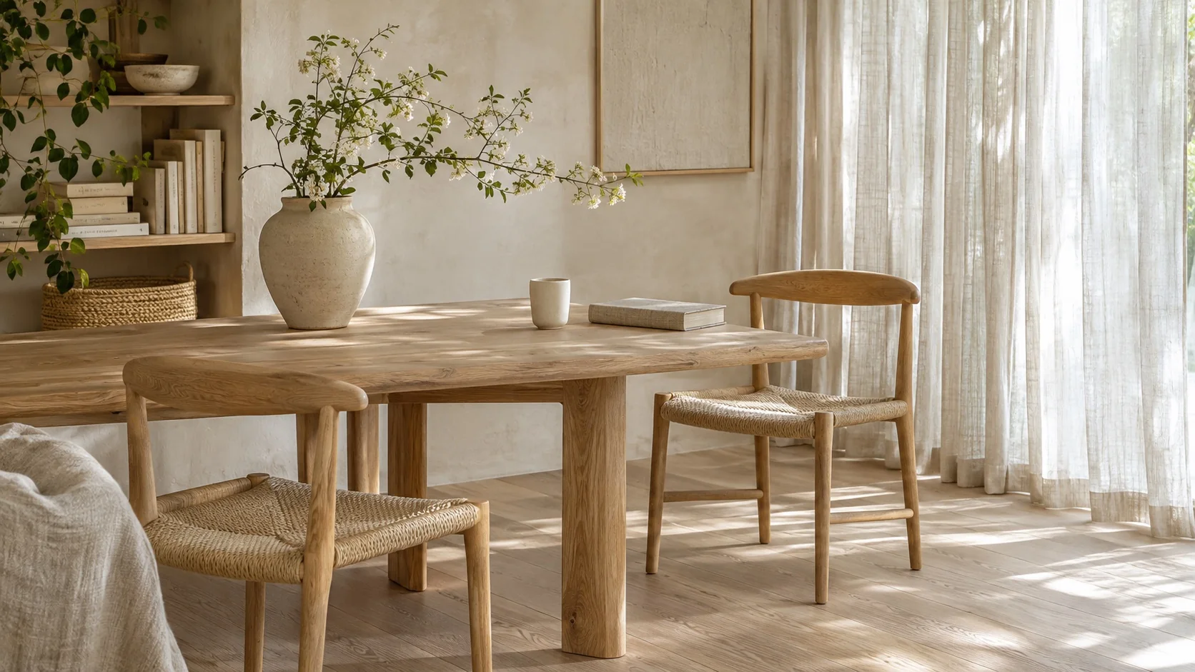
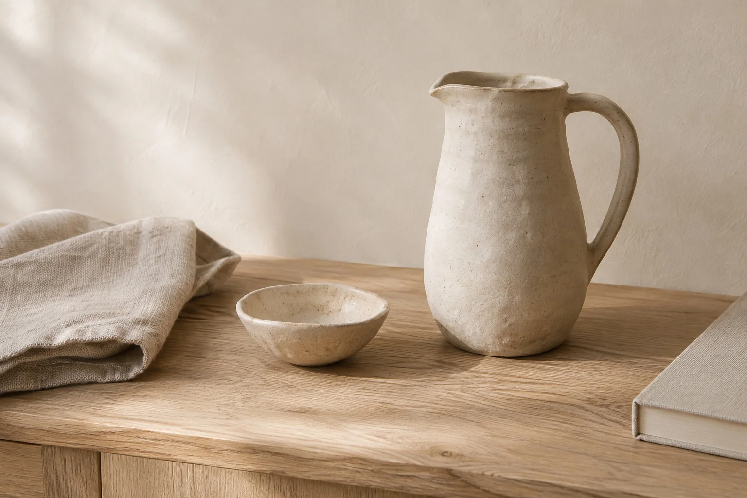
下載 · 白橡木室內照片 · 陶器習作照片 · Geist 可變字型
@font-face { font-family: 'Geist'; font-style: normal; font-weight: 100 900; font-display: swap; src: url('/fonts/GeistVariable.woff2') format('woff2');}@theme { --color-brand: light-dark(#665442, #d7c2a6); --spacing-story: 1.5rem;}@theme { --font-sans: 'Geist';}@layer components { .journal { font-family: var(--font-family-sans); font-size: 13px; line-height: 1.6; font-weight: 350; } .journal :where(h2, h3, p) { margin: 0; } .journal a { color: inherit; text-decoration: none; } .journal a:hover { text-decoration: underline; text-underline-offset: .2em; } .journal :focus-visible { outline: 2px solid var(--color-brand); outline-offset: 4px; } .journal-head { padding: 20px 24px; border-bottom: 1px solid var(--color-line-subtle); } .journal-brand { font-size: 25px; line-height: 1; font-weight: 500; letter-spacing: -.06em; } .journal-edition { font-size: 10px; letter-spacing: .1em; text-transform: uppercase; } .journal-nav { display: flex; flex-wrap: wrap; gap: 12px 20px; font-size: 12px; } .journal-main { min-width: 0; } .journal-photo { display: block; width: 100%; height: auto; aspect-ratio: 16 / 9; object-fit: cover; border-radius: 4px; outline: 1px solid light-dark(rgb(0 0 0 / .08), rgb(255 255 255 / .08)); outline-offset: -1px; } .journal-kicker { font-size: 11px; line-height: 1.5; letter-spacing: .09em; text-transform: uppercase; } .journal-title { max-width: 12ch; font-size: clamp(28px, 4.8vw, 36px); line-height: 1.08; font-weight: 400; letter-spacing: -.04em; } .journal-deck { max-width: 44ch; font-size: 14px; line-height: 1.7; } .journal-meta { font-size: 11px; line-height: 1.5; } .journal-read { border-top: 1px solid var(--color-line-subtle); padding-top: 4px; } .journal-read > summary { width: fit-content; padding: 10px 0; cursor: pointer; font-size: 13px; } .journal-copy { display: grid; gap: 12px; padding-top: 6px; font-size: 14px; line-height: 1.8; } .journal-aside { min-width: 0; border-top: 1px solid var(--color-line-subtle); } .journal-aside-title { font-size: 23px; line-height: 1.2; letter-spacing: -.03em; font-weight: 400; } .journal-story { border-top: 1px solid var(--color-line-subtle); } .journal-story > summary { display: flex; align-items: start; justify-content: space-between; gap: 12px; padding-block: 20px; cursor: pointer; list-style: none; } .journal-story > summary::-webkit-details-marker { display: none; } .journal-story-title { margin-top: 7px; font-size: 16px; line-height: 1.4; font-weight: 400; letter-spacing: -.015em; } .journal-story-image { display: block; width: 64px; height: 76px; object-fit: cover; border-radius: 3px; } .journal-story-arrow { font-size: 20px; line-height: 1; } .journal-story[open] .journal-story-arrow { transform: rotate(45deg); } .journal-story > p { padding-bottom: 20px; font-size: 13px; line-height: 1.8; } .journal-about { display: grid; gap: 8px; padding: 20px 24px; border-top: 1px solid var(--color-line-subtle); font-size: 12px; line-height: 1.7; } .journal-about p { max-width: 48ch; } @media (width >= 38rem) { .journal-grid { display: grid; grid-template-columns: 1.6fr 1fr; } .journal-aside { border-top: 0; border-left: 1px solid var(--color-line-subtle); } .journal-about { grid-template-columns: 1fr auto; align-items: center; gap: 24px; } } @media (width < 24rem) { .journal-head { padding: 20px; } .journal-edition-label { display: none; } .journal-nav { gap: 16px; } }}<article class="journal r-lg overflow-hidden bg-surface-raised fg-text-body shadow-sm" aria-label="Fieldwork journal"> <header class="journal-head grid gap-md"> <div class="flex flex-wrap items-center justify-between gap-md"> <span class="journal-brand fg-text-strong">Fieldwork<span class="fg-brand">.</span></span> <span class="journal-edition fg-text-muted"><span class="journal-edition-label">An independent journal · </span>Issue 04</span> </div> <nav class="journal-nav fg-text-muted" aria-label="Journal sections"> <a href="#fieldwork-lead">Featured story</a> <a href="#fieldwork-notes">Field notes</a> <a href="#fieldwork-about">About</a> </nav> </header> <div class="journal-grid"> <section id="fieldwork-lead" class="journal-main grid gap-md p-story" aria-labelledby="fieldwork-title"> <img class="journal-photo" src="/images/blog/v2/white-oak-room.webp" alt="White oak chairs and a dining table beside sheer linen curtains" width="1672" height="941" /> <p class="journal-kicker fg-brand">Spaces / Quiet interiors</p> <h2 id="fieldwork-title" class="journal-title fg-text-strong">The everyday, considered.</h2> <p class="journal-deck fg-text-muted">On slowing down, looking closer, and finding a little more in the spaces we inhabit.</p> <p class="journal-meta fg-text-muted">Field note 01 — At home</p> <details class="journal-read"> <summary class="fg-brand">Read the field note</summary> <div class="journal-copy"> <p>Morning light moves across the oak table. A cup, a book, a chair pulled close. The room asks for very little, and gives something back: space to read, to think, to begin again.</p> <p>Its character lives in small decisions. The soft edge of a tabletop. Linen that lets the light through. A place for the objects we reach for every day. Nothing needs to compete for attention.</p> <p>A good home makes room for the everyday.</p> </div> </details> </section> <aside id="fieldwork-notes" class="journal-aside p-story" aria-labelledby="fieldwork-notes-title"> <div class="grid gap-sm pb-lg"> <p class="journal-kicker fg-brand">The art of noticing</p> <h2 id="fieldwork-notes-title" class="journal-aside-title fg-text-strong">Quiet spaces.<br>Everyday rituals.</h2> <p class="journal-deck fg-text-muted">Thoughtful spaces and useful objects. A little less, made with care.</p> </div> <details class="journal-story"> <summary> <span><span class="journal-meta fg-text-muted">02 / Objects</span><span class="journal-story-title block fg-text-strong">Room to make something.</span></span> <img class="journal-story-image" src="/images/blog/v2/ceramic-study.webp" alt="A ceramic pitcher and bowl on a white oak table" width="1536" height="1024" /> </summary> <p>Clay keeps a record of the hand. A slightly uneven rim, a glaze that settles into the surface, a handle shaped to be held. Useful objects can make a daily ritual feel considered.</p> </details> <details class="journal-story"> <summary> <span><span class="journal-meta fg-text-muted">03 / In practice</span><span class="journal-story-title block fg-text-strong">The things we choose to keep.</span></span> <span class="journal-story-arrow fg-text-muted" aria-hidden="true">+</span> </summary> <p>A room takes shape through what stays. Start with the pieces you use, give each one a place, and leave a little space between them. The goal is a home that works for the life inside it.</p> </details> </aside> </div> <footer id="fieldwork-about" class="journal-about fg-text-muted"> <p>Fieldwork is an illustrative journal about thoughtful spaces and everyday rituals, created for the Master CSS 2.0 release.</p> <span>Good spaces. Considered living.</span> </footer></article>產生的 CSS
@font-face { font-family: Geist; font-style: normal; font-weight: 100 900; font-display: swap; src: url("/fonts/GeistVariable.woff2") format("woff2");}@layer components { .journal { font-family: var(--font-family-sans); font-size: 13px; font-weight: 350; line-height: 1.6; } .journal :where(h2, h3, p) { margin: 0; } .journal a { color: inherit; text-decoration: none; } .journal a:hover { text-underline-offset: .2em; text-decoration: underline; } .journal :focus-visible { outline: 2px solid var(--color-brand); outline-offset: 4px; } .journal-head { border-bottom: 1px solid var(--color-line-subtle); padding: 20px 24px; } .journal-brand { letter-spacing: -.06em; font-size: 25px; font-weight: 500; line-height: 1; } .journal-edition { letter-spacing: .1em; text-transform: uppercase; font-size: 10px; } .journal-nav { flex-wrap: wrap; gap: 12px 20px; font-size: 12px; display: flex; } .journal-main { min-width: 0; } .journal-photo { aspect-ratio: 16 / 9; object-fit: cover; outline-offset: -1px; border-radius: 4px; outline: 1px solid light-dark(#00000014, #ffffff14); width: 100%; height: auto; display: block; } .journal-kicker { letter-spacing: .09em; text-transform: uppercase; font-size: 11px; line-height: 1.5; } .journal-title { letter-spacing: -.04em; max-width: 12ch; font-size: clamp(28px, 4.8vw, 36px); font-weight: 400; line-height: 1.08; } .journal-deck { max-width: 44ch; font-size: 14px; line-height: 1.7; } .journal-meta { font-size: 11px; line-height: 1.5; } .journal-read { border-top: 1px solid var(--color-line-subtle); padding-top: 4px; } .journal-read > summary { cursor: pointer; width: fit-content; padding: 10px 0; font-size: 13px; } .journal-copy { gap: 12px; padding-top: 6px; font-size: 14px; line-height: 1.8; display: grid; } .journal-aside { border-top: 1px solid var(--color-line-subtle); min-width: 0; } .journal-aside-title { letter-spacing: -.03em; font-size: 23px; font-weight: 400; line-height: 1.2; } .journal-story { border-top: 1px solid var(--color-line-subtle); } .journal-story > summary { cursor: pointer; justify-content: space-between; align-items: start; gap: 12px; padding-block: 20px; list-style: none; display: flex; } .journal-story > summary::-webkit-details-marker { display: none; } .journal-story-title { letter-spacing: -.015em; margin-top: 7px; font-size: 16px; font-weight: 400; line-height: 1.4; } .journal-story-image { object-fit: cover; border-radius: 3px; width: 64px; height: 76px; display: block; } .journal-story-arrow { font-size: 20px; line-height: 1; } .journal-story[open] .journal-story-arrow { transform: rotate(45deg); } .journal-story > p { padding-bottom: 20px; font-size: 13px; line-height: 1.8; } .journal-about { border-top: 1px solid var(--color-line-subtle); gap: 8px; padding: 20px 24px; font-size: 12px; line-height: 1.7; display: grid; } .journal-about p { max-width: 48ch; } @media (width >= 38rem) { .journal-grid { grid-template-columns: 1.6fr 1fr; display: grid; } .journal-aside { border-top: 0; border-left: 1px solid var(--color-line-subtle); } .journal-about { grid-template-columns: 1fr auto; align-items: center; gap: 24px; } } @media (width < 24rem) { .journal-head { padding: 20px; } .journal-edition-label { display: none; } .journal-nav { gap: 16px; } }}@layer theme { :root, :host { --color-zinc-30: oklch(78% .0025 265); --color-zinc-40: oklch(68.6% .0028 265); --color-zinc-60: oklch(48.6% .003 265); --color-zinc-70: oklch(39.8% .0028 265); --color-zinc-90: oklch(24.6% .0022 265); --color-zinc-100: oklch(15% .0016 265) } :root, :host { --color-surface-raised: light-dark(var(--color-white), var(--color-zinc-90)); --color-line-subtle: light-dark(oklch(0% 0 none / .06), oklch(100% 0 none / .06)); --color-text-body: light-dark(var(--color-zinc-70), var(--color-zinc-30)); --color-text-strong: light-dark(var(--color-zinc-100), var(--color-white)); --color-text-muted: light-dark(var(--color-zinc-60), var(--color-zinc-40)) } :root, :host { --color-white: oklch(100% 0 none) } :root, :host { --font-family-sans: var(--font-sans, ui-sans-serif), system-ui, -apple-system, BlinkMacSystemFont, "Segoe UI", Roboto, "Helvetica Neue", Arial, "Noto Sans", sans-serif, "Apple Color Emoji", "Segoe UI Emoji", "Segoe UI Symbol", "Noto Color Emoji"; --radius-lg: .5rem; --spacing-sm: .75rem; --spacing-md: 1rem; --spacing-lg: 1.5rem } :root, :host { --shadow-sm: 0 0 0 1px light-dark(oklch(0% 0 none / .04), oklch(100% 0 none / .05)), 0 1px 1px -.5px light-dark(oklch(0% 0 none / .045), oklch(0% 0 none / .3)), 0 2px 2px -1px light-dark(oklch(0% 0 none / .04), oklch(0% 0 none / .26)), 0 4px 4px -2px light-dark(oklch(0% 0 none / .04), oklch(0% 0 none / .24)) } :root, :host { --color-brand: light-dark(#665442, #d7c2a6); --spacing-story: 1.5rem } :root, :host { --font-sans: "Geist" }}@layer utilities { .items-center { align-items: center } .bg-surface-raised { background-color: var(--color-surface-raised) } .r-lg { border-radius: var(--radius-lg) } .shadow-sm { box-shadow: var(--shadow-sm) } .fg-brand { color: var(--color-brand) } .fg-text-body { color: var(--color-text-body) } .fg-text-muted { color: var(--color-text-muted) } .fg-text-strong { color: var(--color-text-strong) } .block { display: block } .flex { display: flex } .grid { display: grid } .flex-wrap { flex-wrap: wrap } .gap-md { gap: var(--spacing-md) } .gap-sm { gap: var(--spacing-sm) } .justify-between { justify-content: space-between } .overflow-hidden { overflow: hidden } .p-story { padding: var(--spacing-story) } .pb-lg { padding-bottom: var(--spacing-lg) }}縮窄預覽,側欄會接在主文後面。打開一篇文章,版面會為內容騰出空間。切換主題時,重點色隨之改變,共用的間距則讓閱讀節奏一致。預覽裡也可以查看 HTML 和 CSS。
#在一個 class 裡表達更多
Master CSS 讓樣式決策跟著元素走。用 flex 和 grid 排版,用 gap-md 和 p-lg 套用專案 token,再把選擇器和條件寫在它們所限定的 class 上。
<a class="inline-flex px-md py-xs r-md fg-blue-60 fg-blue-70:hover@sm" href="/journal"> Read the journal</a>從左到右讀 fg-blue-70:hover@sm。檢視區寬度達到 sm 斷點,而且游標停在元素上時,就會套用 blue-70 色彩 token。預設門檻是 52.125rem。Master CSS 生成規則,瀏覽器則判斷選擇器和媒體查詢是否符合。
在一個 class 裡寫清楚條件
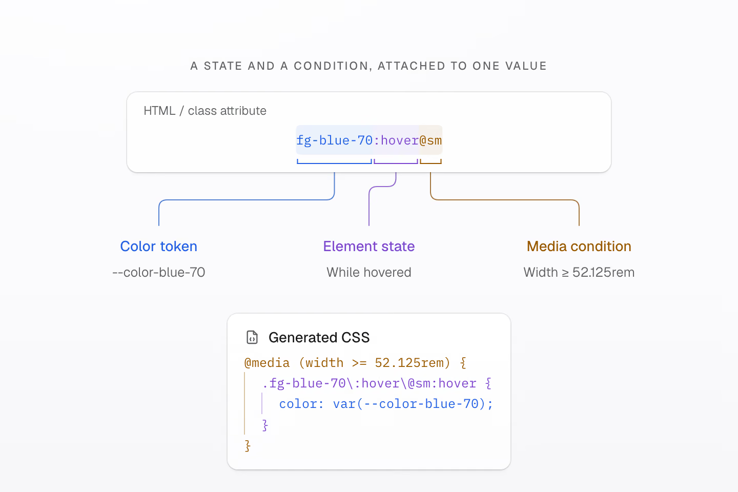
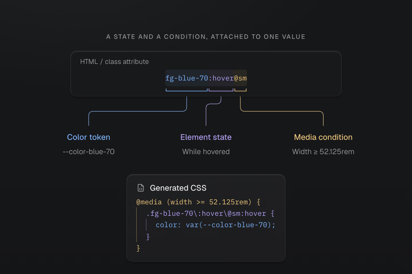
這個 class 把值、選擇器和條件寫在一起。瀏覽器會判斷生成的選擇器和媒體查詢是否符合。
文字說明
- fg-blue-70 選用 color: var(--color-blue-70)。:hover 將滑鼠停留狀態套在帶有這個 class 的元素上。
- @sm 使用預設媒體條件 (width >= 52.125rem)。查詢條件和 hover 狀態必須同時符合。
可以依要表達的樣式選擇寫法。
| Class | 含義 |
|---|---|
p-lg | 使用 --spacing-lg token 設定內距。 |
m(0) | 外距為零。 |
p(16) | 內距為 16px。 |
grow(1) | Flex 伸展比例為 1,沒有單位。 |
grid-cols(3) | 三個等寬的 Grid 欄位。 |
(aspect-ratio:4/3) | 原生 CSS 屬性和值。 |
數值函式的單位取決於對應的屬性。p(16) 是長度,grow(1) 則沒有單位。原生宣告也接受 CSS 函式和自訂屬性。使用 (width:var(--progress)) 時,JavaScript 可以更新變數值,class 本身維持相同。
更多組合 class 的方式
| Class | 含義 |
|---|---|
fg-blue-60/.5 · -mt-sm | 將色彩不透明度設為 50%,或使用負值的間距 token。 |
fg-blue-60:hover>a · fg-blue-60_a | 選取游標停留在父元素上時的直屬連結,或選取後代連結。 |
grid@supports(display:grid) | 以原生功能查詢包住規則。 |
(opacity:0)@starting-style | 設定 CSS 轉場的起始不透明度。 |
p-md! | 將內距宣告標為 !important。 |
:focus-visible、:has() 和 ::before 等選擇器可以搭配 @media(...)、@supports(...) 和 @container(...)。多個條件會彼此巢狀,必須全部符合。生成的結果是可以直接檢查的一般 CSS。
想動手試試,可以從語法教學開始。
#建立自己的設計系統
先用預設的色彩、間距、排版、圓角、陰影和動態效果 token。介面逐漸有了自己的風格,再用 @theme 為專案的設計決策命名。
#廣色域色盤
十七組色相,每組十一個色階。預設色盤使用 OKLCH,有些色彩超出 sRGB,延伸至 Display P3 色域。每欄由淺至深排列,實際可見的範圍取決於螢幕。
可以用 fg-blue-50 或 bg-green-90 直接選用色階,也可以依用途命名。Fieldwork 共用同一個重點色和文章內距。請將下方的定義加在應用樣式表的 @import '@master/css' 後面。
用自己的配色呈現一篇短文
@theme { --color-brand: light-dark(#665442, #d7c2a6); --spacing-story: 1.5rem;}<article class="max-w-sm mx-auto overflow-hidden r-lg bg-surface-raised shadow-sm"> <div class="grid gap-sm p-story"> <p class="m(0) text-xs fg-brand">Fieldwork / Issue 04</p> <h2 class="m(0) text-2xl font-regular fg-text-strong">The everyday, considered.</h2> <p class="m(0) text-sm fg-text-muted">A field note on slowing down, looking closer, and finding a little more in the spaces we inhabit.</p> <details class="text-sm"> <summary class="(cursor:pointer) fg-brand py-xs">Read the field note</summary> <p class="m(0) pt-sm fg-text-body">Morning light moves across the oak table. A cup, a book, a chair pulled close. The room asks for very little, and gives something back: space to read, to think, to begin again. A good home makes room for the everyday.</p> </details> </div></article>產生的 CSS
@layer theme { :root, :host { --color-zinc-30: oklch(78% .0025 265); --color-zinc-40: oklch(68.6% .0028 265); --color-zinc-60: oklch(48.6% .003 265); --color-zinc-70: oklch(39.8% .0028 265); --color-zinc-90: oklch(24.6% .0022 265); --color-zinc-100: oklch(15% .0016 265) } :root, :host { --color-surface-raised: light-dark(var(--color-white), var(--color-zinc-90)); --color-text-body: light-dark(var(--color-zinc-70), var(--color-zinc-30)); --color-text-strong: light-dark(var(--color-zinc-100), var(--color-white)); --color-text-muted: light-dark(var(--color-zinc-60), var(--color-zinc-40)) } :root, :host { --color-white: oklch(100% 0 none) } :root, :host { --font-weight-regular: 400; --font-size-xs: .75rem; --font-size-sm: .875rem; --font-size-2xl: 1.5rem; --text-xs: var(--font-size-xs); --text-xs--line-height: 1.5; --text-xs--letter-spacing: 0; --text-sm: var(--font-size-sm); --text-sm--line-height: 1.5; --text-sm--letter-spacing: 0; --text-2xl: var(--font-size-2xl); --text-2xl--line-height: 1.35; --text-2xl--letter-spacing: -.015em; --radius-lg: .5rem; --spacing-xs: .5rem; --spacing-sm: .75rem; --container-sm: 24rem } :root, :host { --shadow-sm: 0 0 0 1px light-dark(oklch(0% 0 none / .04), oklch(100% 0 none / .05)), 0 1px 1px -.5px light-dark(oklch(0% 0 none / .045), oklch(0% 0 none / .3)), 0 2px 2px -1px light-dark(oklch(0% 0 none / .04), oklch(0% 0 none / .26)), 0 4px 4px -2px light-dark(oklch(0% 0 none / .04), oklch(0% 0 none / .24)) } :root, :host { --color-brand: light-dark(#665442, #d7c2a6); --spacing-story: 1.5rem }}@layer utilities { .text-2xl { font-size: var(--text-2xl); line-height: var(--text-2xl--line-height, normal); letter-spacing: var(--text-2xl--letter-spacing, normal) } .text-sm { font-size: var(--text-sm); line-height: var(--text-sm--line-height, normal); letter-spacing: var(--text-sm--letter-spacing, normal) } .text-xs { font-size: var(--text-xs); line-height: var(--text-xs--line-height, normal); letter-spacing: var(--text-xs--letter-spacing, normal) } .bg-surface-raised { background-color: var(--color-surface-raised) } .r-lg { border-radius: var(--radius-lg) } .shadow-sm { box-shadow: var(--shadow-sm) } .fg-brand { color: var(--color-brand) } .fg-text-body { color: var(--color-text-body) } .fg-text-muted { color: var(--color-text-muted) } .fg-text-strong { color: var(--color-text-strong) } .grid { display: grid } .font-regular { font-weight: var(--font-weight-regular) } .gap-sm { gap: var(--spacing-sm) } .m\(0\) { margin: calc(0 * 1px) } .mx-auto { margin-inline: auto } .max-w-sm { max-width: var(--container-sm) } .overflow-hidden { overflow: hidden } .p-story { padding: var(--spacing-story) } .py-xs { padding-block: var(--spacing-xs) } .pt-sm { padding-top: var(--spacing-sm) } .\(cursor\:pointer\) { cursor: pointer }}fg-brand 讀取 --color-brand,p-story 讀取 --spacing-story。改一個 token,所有使用它的元素就會一起更新。下方兩張卡片的重點色隨配色切換,內距都維持 1.5rem。
共用 token,切換兩種配色
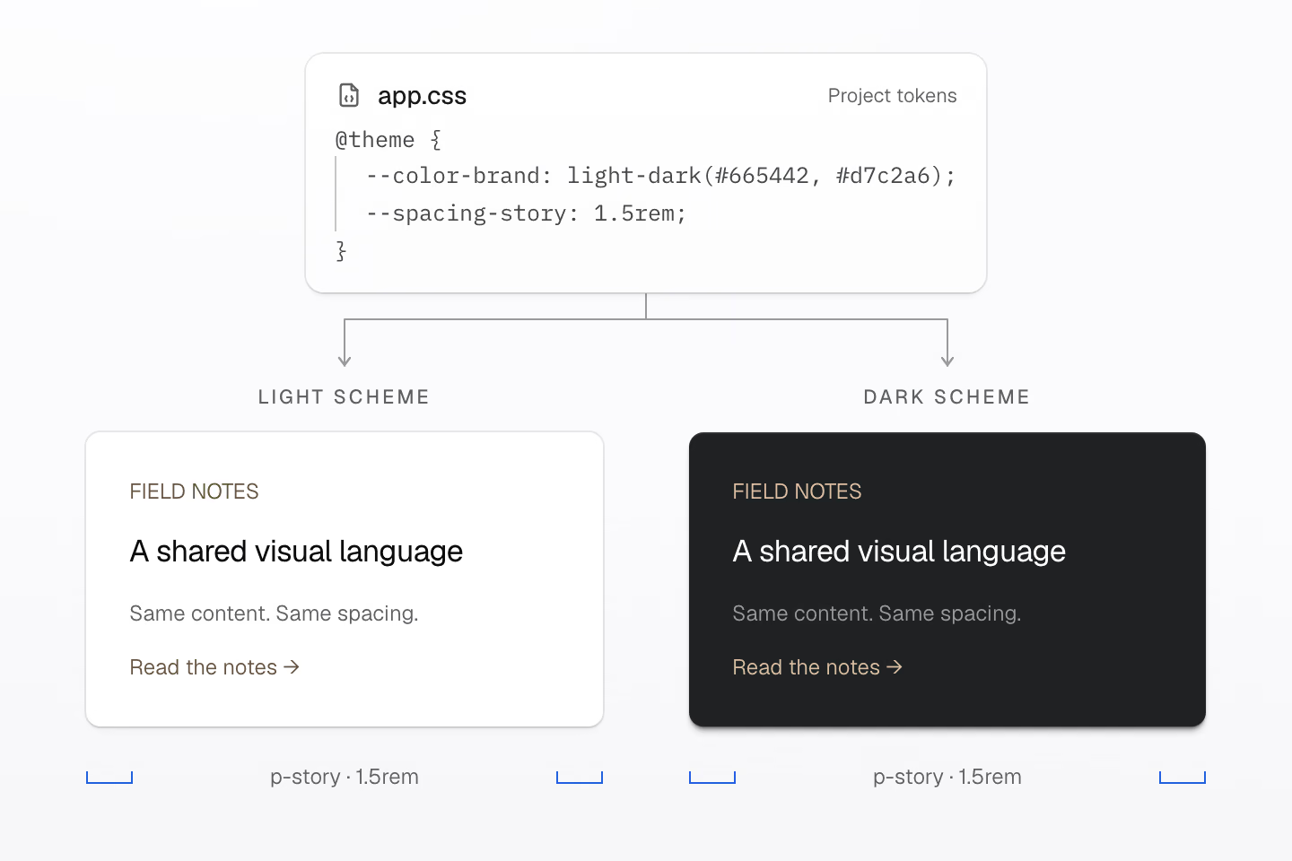
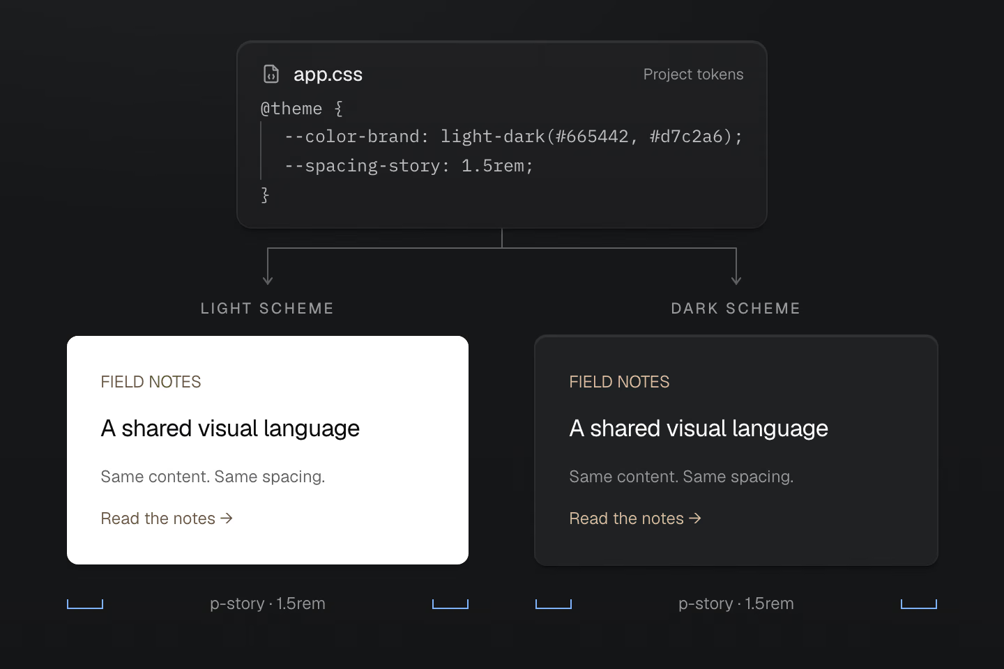
兩張卡片共用同一份標記。原生 light-dark() 選出重點色,量尺顯示 p-story 在兩張卡片上都提供 1.5rem 的內容內距。
文字說明
- 樣式表把 --color-brand 設為 light-dark(#665442,
- 兩張文字卡片都使用 fg-brand 和 p-story。亮色卡片用第一個重點色,暗色卡片用第二個。文字、版面和 1.5rem 內距都相同。
原生 light-dark() 會依目前的 color-scheme 選用重點色。預設色盤中按用途命名的表面色和文字色,也會跟著配色切換。把需要一起變動的設計決策命名為 token,避免只因為目前的值相同就將它們綁在一起。
#為響應式條件命名
用 @custom-media 為檢視區條件命名,或用 @custom-container 為容器條件命名。
@custom-media --reading (width >= 60rem);@custom-container --story-wide (width >=28rem);<section class="container-inline (container-name:story)"> <article class="grid gap-md p-md p-lg@reading grid-cols(2)@container(story_--story-wide)"> <h2 class="m(0)">A layout that knows its space</h2> <p class="m(0)">Two columns when this container has room.</p> </article></section>產生的 CSS
@layer theme { :root, :host { --spacing-md: 1rem; --spacing-lg: 1.5rem }}@layer utilities { .container-inline { container-type: inline-size } .grid { display: grid } .gap-md { gap: var(--spacing-md) } .m\(0\) { margin: calc(0 * 1px) } .p-md { padding: var(--spacing-md) } .\(container-name\:story\) { container-name: story } @container story (width >= 28rem) { .grid-cols\(2\)\@container\(story_--story-wide\) { display: grid; grid-template-columns: repeat(2, minmax(0, 1fr)) } } @media (width >= 60rem) { .p-lg\@reading { padding: var(--spacing-lg) } }}p-lg@reading 依檢視區寬度而定,grid-cols(2)@container(story_--story-wide) 則看父層中名為 story 的容器。前者回應頁面寬度,後者回應元件可用的空間。在 class 中,_ 代表值或查詢裡的空格,因此 @container(story_--story-wide) 會以 --story-wide 判斷 story 容器;字面上的底線則寫成 \_。在應用的樣式表中,同樣的條件也可寫成 @media (--reading) 和 @container story (--story-wide)。Master CSS 會把兩種寫法都展開為一般 CSS 查詢。
從主題 token和色彩了解如何建立符合專案需求的設計基礎。
#用原生 CSS 建立可重用的樣式
文章連結、導覽項目或對話框都可以有自己的 CSS。preset 建立五個串接層,分別是 theme、base、defaults、components 和 utilities。把共用樣式放進 components,再用 utility 做局部調整。
@layer components { .story-link { display: inline-flex; padding-inline: 1rem; padding-block: 0.5rem; border-radius: 0.375rem; background-color: var(--color-surface-raised); color: var(--color-text-body); text-decoration: none; }}<a class="story-link" href="/journal">Read the journal</a><a class="story-link px-lg" href="/journal">Read the journal</a>產生的 CSS
@layer components { .story-link { background-color: var(--color-surface-raised); color: var(--color-text-body); border-radius: .375rem; padding-block: .5rem; padding-inline: 1rem; text-decoration: none; display: inline-flex; }}@layer theme { :root, :host { --color-zinc-30: oklch(78% .0025 265); --color-zinc-70: oklch(39.8% .0028 265); --color-zinc-90: oklch(24.6% .0022 265) } :root, :host { --color-surface-raised: light-dark(var(--color-white), var(--color-zinc-90)); --color-text-body: light-dark(var(--color-zinc-70), var(--color-zinc-30)) } :root, :host { --color-white: oklch(100% 0 none) } :root, :host { --spacing-lg: 1.5rem }}@layer utilities { .px-lg { padding-inline: var(--spacing-lg) }}兩個連結都使用 .story-link。第二個加上 px-lg,將水平內距從 1rem 增加到 1.5rem。對普通宣告而言,排在後面的 utilities 層優先於 components 層。
共用元件,局部調整
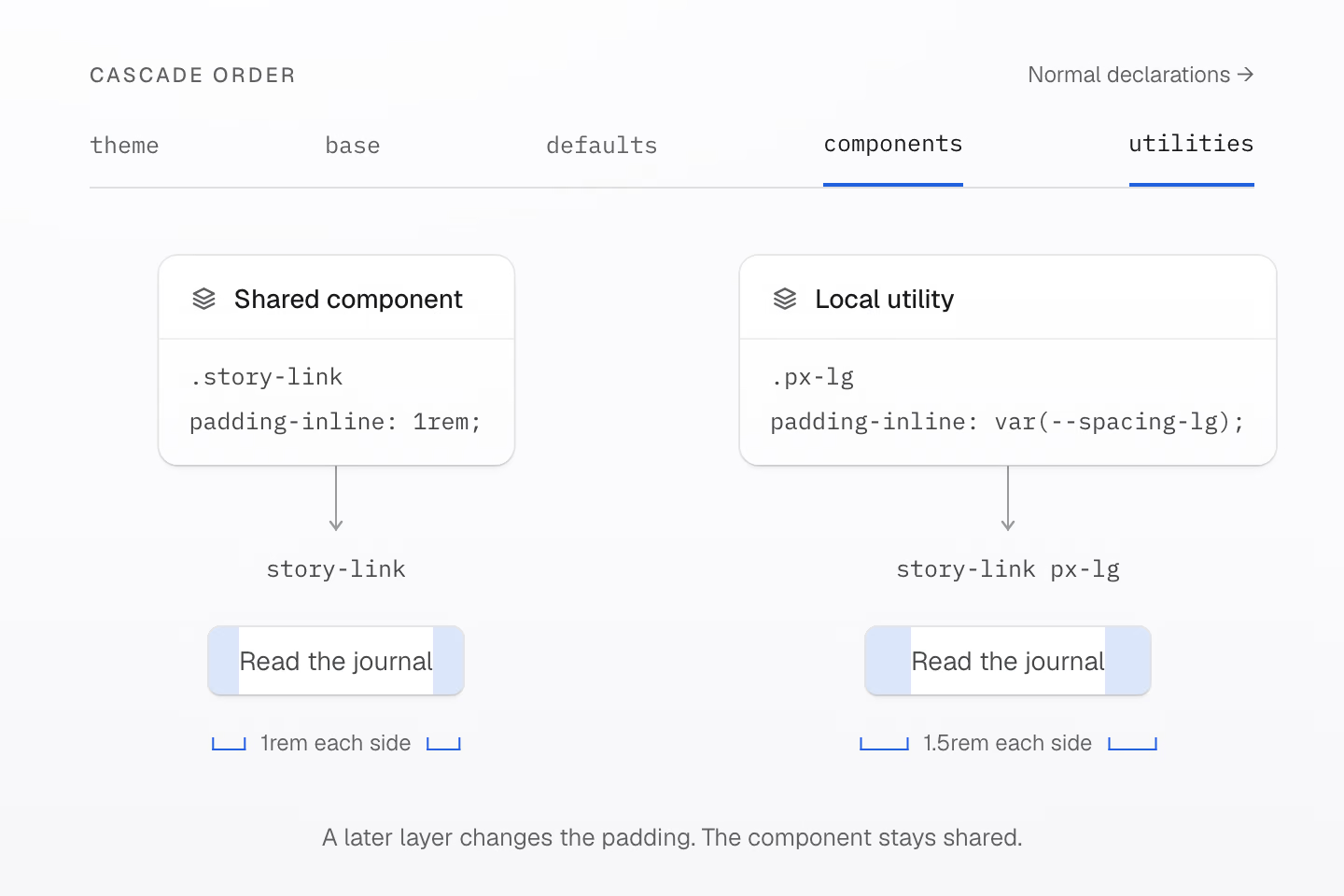
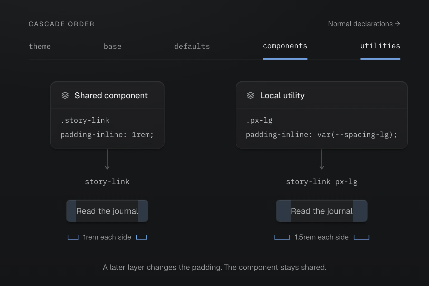
在這些層的普通宣告中,utilities 的優先順序高於 components。藍色區塊標示內距的位置。
文字說明
- components 層的 .story-link 元件設有 1rem 的水平內距,兩個連結共用它的形狀與字體樣式。
- 第二個連結加上 utilities 層的 px-lg,兩側內距各變成 1.5rem。連結文字維持相同。
#選擇要重用的內容
依要共用的內容選擇工具。
| 要共用的內容 | 寫法 |
|---|---|
| 設計值 | 在 @theme 定義 token。 |
| 元件樣式 | 在 @layer components 定義原生 class。 |
| 按需生成的 class | 使用 @utility 定義。 |
| 宣告和條件 | 定義 @mixin,再用 @apply 展開。 |
mixin 本身不會建立 class。下方範例的 --action-row 為原生元件和按需生成的 utility 提供相同的宣告。
@mixin --action-row { display: inline-flex; align-items: center; gap: var(--spacing-xs);}@utility action-row { @apply --action-row;}@mixin --hocus { &:is(:hover, :focus-visible) { @contents; }}@layer components { .story-action { @apply --action-row; }}<a class="story-action underline@apply(--hocus)" href="/journal">Read a story</a><a class="action-row underline@apply(--hocus)" href="/archive">Browse the archive</a>產生的 CSS
@layer components { .story-action { display: inline-flex; align-items: center; gap: var(--spacing-xs) }}@layer theme { :root, :host { --spacing-xs: .5rem }}@layer utilities { .action-row { display: inline-flex; align-items: center; gap: var(--spacing-xs) } .underline\@apply\(--hocus\):is(:hover, :focus-visible) { text-decoration-line: underline }}--hocus 共用滑鼠停留與鍵盤焦點的選擇器。underline@apply(--hocus) 將底線樣式放進它的 @contents 插槽。@apply 接受的是 mixin 呼叫,不能傳入 utility 清單。 Master CSS 會編譯它支援的靜態 mixin 語法,瀏覽器不必原生支援 CSS mixin。
自訂 utility 也可接受靜態參數,或將 token 命名空間連到一組 class。專案自己的詞彙會與 preset 一起提供給編譯器和工具。
重用樣式說明這些寫法,串接層則介紹包括重要宣告與未分層樣式在內的優先順序。
#選擇如何交付 CSS
依照應用程式何時能取得完整的 class 名稱,選擇適合的渲染模式。
預設使用靜態模式。 在建置時掃描完整的 class 名稱並輸出樣式表。瀏覽器無須載入 Master CSS runtime。
預先渲染模式(prerender)將生成的 CSS 隨 HTML 一起交付。 當整合能讀取完成的 HTML,且其中已包含頁面需要的所有 class 時,就適合使用這種模式。瀏覽器無須載入 Master CSS runtime。
Runtime 模式在瀏覽器生成 CSS。 編輯器、線上實驗環境或部署後更新的內容若會引入建置時未知的 class,可以使用這種模式。Runtime 和漸進式模式都包含瀏覽器端 JavaScript。
漸進式模式從已渲染的 HTML 開始。 先交付頁面的初始 CSS,等後續出現尚未涵蓋的 class,再由瀏覽器生成規則。只要已有有效的初始 CSS 和 hydration manifest,預設 runtime 就可以等到那時再載入引擎。
同一套寫法,四種 CSS 交付方式
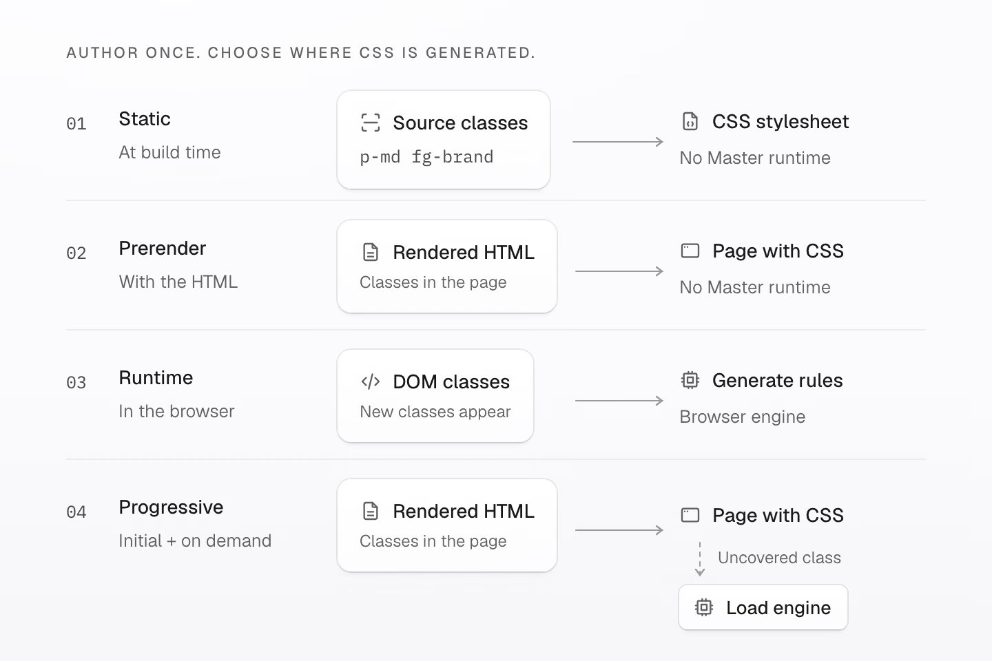
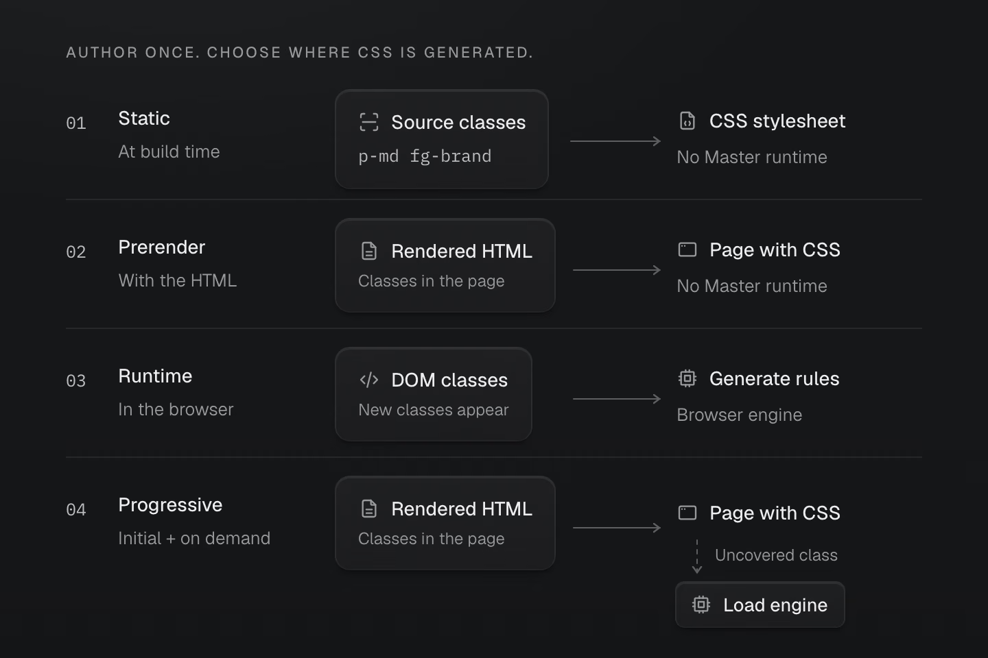
每條路徑都可獨立使用。漸進式模式在有有效 hydration 資料時,可延後載入引擎。
文字說明
- 靜態模式在建置時掃描來源中的完整 class,瀏覽器收到樣式表,無須載入 Master CSS runtime。
- 預先渲染模式根據已渲染的 HTML 生成初始 CSS,並隨該 HTML 交付。無須載入 Master CSS runtime。
- Runtime 模式依據已連接 DOM 的 class 在瀏覽器生成 CSS,可以處理稍後才出現的 class,並會載入瀏覽器端 JavaScript。
- 漸進式模式從渲染後的 HTML 取得初始 CSS。有效的樣式表與頁面 manifest 讓預設 runtime 可以等到出現未涵蓋的 class 再載入引擎。
Fieldwork 使用靜態模式,也能展開文章、回應媒體查詢與切換主題。介面可以互動,CSS 仍可在建置時生成。
各種渲染方式的適用範圍
CLI 與 Vite 正式建置會將符合條件的本機匯入合併進生成的 CSS。請部署完整的資源集合,讓保留的樣式表、字型和圖片也能載入。
Next.js 的漸進式整合會處理建置時生成的 HTML。這個模式下,請求時動態生成的 SSR 回應仰賴瀏覽器 runtime。
來源掃描不會執行任意的字串插值。各整合的適用範圍與回應驗證方式,請見渲染模式。
核心語意由 Rust 實作。瀏覽器裡的 JavaScript 引擎會執行編譯後的程式,並與 Rust 的輸出比對,確認結果一致。
控制來源掃描、共用定義與樣式修剪
| 指令 | 用途 |
|---|---|
@source / @source not | 新增或排除要掃描的來源檔案。 |
@safelist / @blocklist | 保留或排除候選 class。 |
@reference | 共用定義,不帶入被參照檔案的原生 CSS。 |
@prune native | 建置提供 class 使用資訊時,允許移除檔案中未使用的原生樣式和受管理的關鍵影格。 |
預設會保留原生樣式。掃描與修剪說明如何明確設定這些範圍。
#量測頁面實際交付的 CSS
v2.0.0 正式建置中的 Master CSS 指南首頁,行內樣式和連結樣式表合計為 Brotli 壓縮後 24.5 kB,未壓縮 110.4 kB。大部分來自連結的檔案,其中包含文件站自身的元件樣式。該頁生成的 style#master-css 區塊在壓縮前占 833 bytes。
文件頁面使用的 CSS 大小
7 個文件頁面 · 單位 kB
 Master CSS
 Angular
 Vue.js
 Material UI
 Bootstrap
 Next.js
 Tailwind CSSAngularMaster CSSMaterial UIBootstrapVue.jsTailwind CSSNext.js
各頁面的設計、內容與建置流程不同。圖表計入初始 HTML 裡的行內樣式與它連結的樣式表,網路傳輸量與框架效能要另外量測。若要用同一個介面做對照,可以看分別用 Master CSS 和 Tailwind CSS 建置同一個介面的結果。
#讀得懂專案的工具
語言服務會讀取專案的定義。你可以在編輯器裡補全 token 名稱、移動游標查看生成的 CSS,以及使用色彩工具。專案自訂的 utility 和 token 也適用。
#一眼看出 class 的組成
VS Code 擴充套件預設使用 active 模式。語意上色會跟著游標所在的 class,讓值、選擇器、查詢、單位和重要宣告標記一目了然,周圍的標記則維持原來的樣式。
看懂一個 class 的組成
<h2 class="m(0) text-lg">Field notes</h2><a class="fg-blue-70:hover@sm" href="/journal"> Read the journal</a>將游標移到 class 的值上,或按 Tab 移入焦點,即可查看語法色彩。觸控裝置會直接顯示色彩。這個網頁範例使用 Master CSS 的語意分析,VS Code 則跟隨編輯器游標。
各種色彩代表什麼
第一組 class 包含數值函式 m(0) 和 token utility text-lg。第二組結合 fg-blue-70、:hover 選擇器與 @sm 媒體條件。語法上色能辨認這些部分,生成的 CSS 維持相同。
選擇編輯器的語法上色模式
將 masterCSS.embeddedSyntaxHighlighting 設為 active,可替游標所在的 class 上色。always 會為所有偵測到的內嵌 utility 上色,off 則關閉內嵌 utility 的上色。CSS 指令仍會上色,使用中的 VS Code 主題也必須啟用語意上色。
#用程式碼檢查找出問題
ESLint 整合會依照專案設定檢查 class。推薦設定會啟用以下四條規則,規則名稱以 @master/css/ 為前綴。
| 規則 | 用途 |
|---|---|
sort-classes | 維持 class 順序一致並移除重複項目。 |
no-invalid-classes | 找出語法錯誤與無效的生成 CSS。 |
no-conflicting-classes | 回報相同變體範圍內重疊的宣告。 |
prefer-canonical-classes | 建議語意和順序相同的標準寫法。 |
另有兩條規則可依團隊需求自行啟用。
| 規則 | 團隊規範 |
|---|---|
no-unapproved-raw-values | 對支援 token 的 class 要求使用 token,或明確列出例外。 |
prefer-component-classes | 對大量使用組合選擇器的 class 群組,建議抽成元件。 |
自動修正可調整順序、替換為標準寫法,以及移除完全被覆寫的 class。預設會忽略未知的 class 名稱。是否限制原始值、何時抽成元件,則由作者決定。
從找出衝突到安全修正
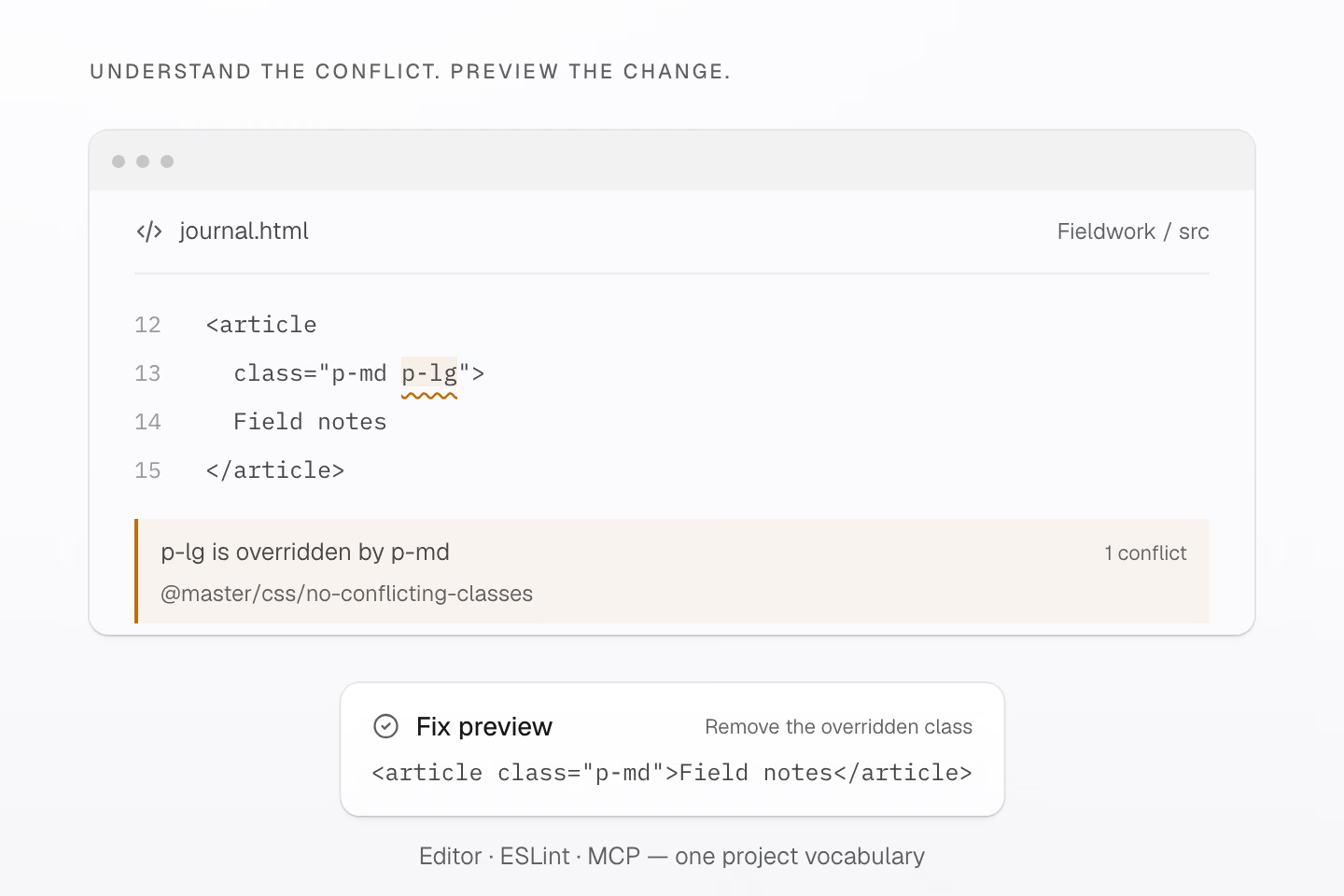
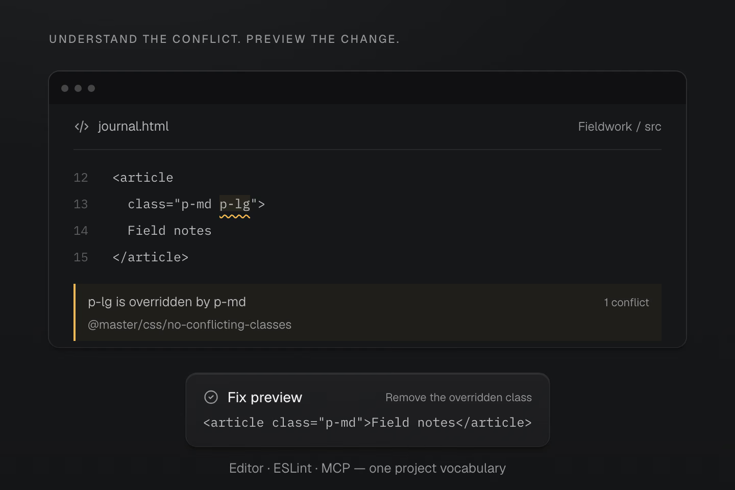
依生成 CSS 的順序,p-md 優先。安全修正會移除 p-lg,並保留原本的樣式結果。
文字說明
- 對於 <article class="p-md p-lg">Field notes</article>,診斷會建議移除 p-lg,因為生成的 CSS 以 p-md 覆寫它。
- 安全修正會產生 <article class="p-md">Field notes</article>。編輯器、lint 工具和 MCP 都會查閱專案解析後的定義。套用預覽時也會檢查來源檔案的雜湊值。
以 p-md p-lg 為例,工具會指出 p-lg 被覆寫,並保留 p-md。CSS 的優先順序不取決於 class 在 HTML 裡的順序。 只有部分重疊的樣式仍需人工確認。Lint 通過後,瀏覽器支援和畫面結果也要另外驗證。設定方式與規則選項請見程式碼檢查。
#讓 AI 讀取專案定義
本機 Master CSS MCP 伺服器讓程式開發代理程式能查詢專案的 token 與 utility、檢查生成的 CSS、執行 lint 並預覽修正。套用預覽時,伺服器會確認受影響的檔案仍與產生預覽時相同。
讓 AI 工具讀取專案的樣式定義
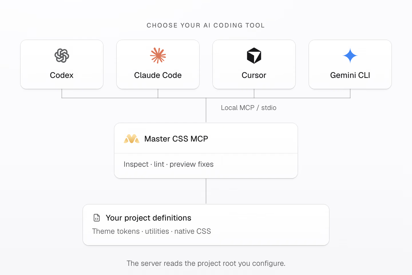
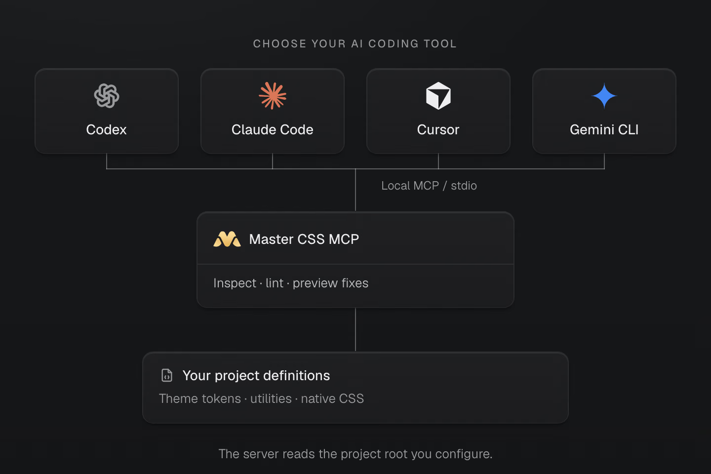
透過本機 stdio 連接 AI 用戶端。伺服器會讀取你設定的專案根目錄。
文字說明
- Codex、Claude Code、Cursor 和 Gemini CLI 都是可用的 MCP 用戶端。設定 Master CSS 伺服器時,請指定要檢查的專案根目錄。
- Master CSS MCP 使用載入的專案資料提供 manifest 查詢、生成 CSS 檢查、lint 診斷與修正預覽。
- 主題 token、utility 和原生 CSS 都留在專案內。套用修正預覽時會檢查來源雜湊值,工具權限由用戶端管理。
連接支援本機 stdio MCP 的用戶端,例如 Codex、Claude Code、Cursor 或 Gemini CLI。設定專案根目錄並確認已載入正確的工作區。工具權限由用戶端管理。
如何在編輯器和代理程式中使用這些專案資訊,請見語言服務與 AI 程式開發流程。
#做出有自己風格的介面
從一個元件開始。加一個狀態,為共用的值命名,再檢查結果。下次遇到實際需要時,就會知道哪些樣式值得重用。
謝謝每一位試用 Master CSS、回報問題或分享作品的人。是你們一起讓 2.0 成形。
安裝 Master CSS,再跟著語法教學做出你的第一個介面。
如果 Master CSS 對你有幫助,歡迎在 GitHub 給它一顆星,讓更多開發者找到它。