





Your design language, written in CSS. Master CSS 2.0 connects expressive classes, project tokens and reusable styles with tools that understand the same definitions. Write a responsive state in one class, shape a theme in your stylesheet, and inspect the CSS as you work.
 Watch the film: Master CSS 2.0 — Your project, understood.
On this page
Meet Fieldwork: a small journal built with that approach.
An idea, given a place on the web
View the HTML and CSS
Add the CSS after @import '@master/css' in your app stylesheet. Place these assets at the paths shown in the source, or update the HTML and @font-face URLs to use your own.
Download · White-oak interior · Ceramic study · Geist variable font
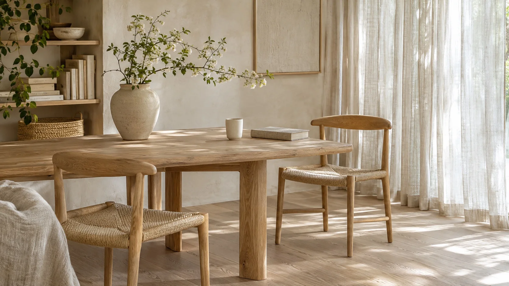
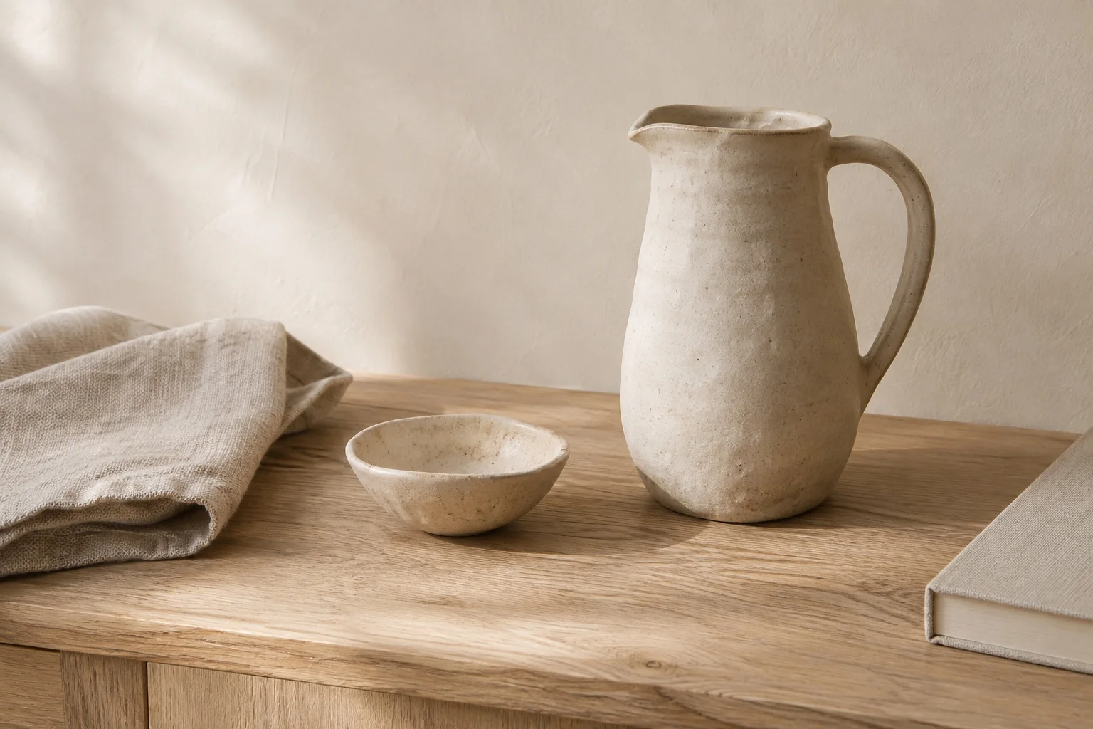
@font-face { font-family: 'Geist'; font-style: normal; font-weight: 100 900; font-display: swap; src: url('/fonts/GeistVariable.woff2') format('woff2');}@theme { --color-brand: light-dark(#665442, #d7c2a6); --spacing-story: 1.5rem;}@theme { --font-sans: 'Geist';}@layer components { .journal { font-family: var(--font-family-sans); font-size: 13px; line-height: 1.6; font-weight: 350; } .journal :where(h2, h3, p) { margin: 0; } .journal a { color: inherit; text-decoration: none; } .journal a:hover { text-decoration: underline; text-underline-offset: .2em; } .journal :focus-visible { outline: 2px solid var(--color-brand); outline-offset: 4px; } .journal-head { padding: 20px 24px; border-bottom: 1px solid var(--color-line-subtle); } .journal-brand { font-size: 25px; line-height: 1; font-weight: 500; letter-spacing: -.06em; } .journal-edition { font-size: 10px; letter-spacing: .1em; text-transform: uppercase; } .journal-nav { display: flex; flex-wrap: wrap; gap: 12px 20px; font-size: 12px; } .journal-main { min-width: 0; } .journal-photo { display: block; width: 100%; height: auto; aspect-ratio: 16 / 9; object-fit: cover; border-radius: 4px; outline: 1px solid light-dark(rgb(0 0 0 / .08), rgb(255 255 255 / .08)); outline-offset: -1px; } .journal-kicker { font-size: 11px; line-height: 1.5; letter-spacing: .09em; text-transform: uppercase; } .journal-title { max-width: 12ch; font-size: clamp(28px, 4.8vw, 36px); line-height: 1.08; font-weight: 400; letter-spacing: -.04em; } .journal-deck { max-width: 44ch; font-size: 14px; line-height: 1.7; } .journal-meta { font-size: 11px; line-height: 1.5; } .journal-read { border-top: 1px solid var(--color-line-subtle); padding-top: 4px; } .journal-read > summary { width: fit-content; padding: 10px 0; cursor: pointer; font-size: 13px; } .journal-copy { display: grid; gap: 12px; padding-top: 6px; font-size: 14px; line-height: 1.8; } .journal-aside { min-width: 0; border-top: 1px solid var(--color-line-subtle); } .journal-aside-title { font-size: 23px; line-height: 1.2; letter-spacing: -.03em; font-weight: 400; } .journal-story { border-top: 1px solid var(--color-line-subtle); } .journal-story > summary { display: flex; align-items: start; justify-content: space-between; gap: 12px; padding-block: 20px; cursor: pointer; list-style: none; } .journal-story > summary::-webkit-details-marker { display: none; } .journal-story-title { margin-top: 7px; font-size: 16px; line-height: 1.4; font-weight: 400; letter-spacing: -.015em; } .journal-story-image { display: block; width: 64px; height: 76px; object-fit: cover; border-radius: 3px; } .journal-story-arrow { font-size: 20px; line-height: 1; } .journal-story[open] .journal-story-arrow { transform: rotate(45deg); } .journal-story > p { padding-bottom: 20px; font-size: 13px; line-height: 1.8; } .journal-about { display: grid; gap: 8px; padding: 20px 24px; border-top: 1px solid var(--color-line-subtle); font-size: 12px; line-height: 1.7; } .journal-about p { max-width: 48ch; } @media (width >= 38rem) { .journal-grid { display: grid; grid-template-columns: 1.6fr 1fr; } .journal-aside { border-top: 0; border-left: 1px solid var(--color-line-subtle); } .journal-about { grid-template-columns: 1fr auto; align-items: center; gap: 24px; } } @media (width < 24rem) { .journal-head { padding: 20px; } .journal-edition-label { display: none; } .journal-nav { gap: 16px; } }}<article class="journal r-lg overflow-hidden bg-surface-raised fg-text-body shadow-sm" aria-label="Fieldwork journal"> <header class="journal-head grid gap-md"> <div class="flex flex-wrap items-center justify-between gap-md"> <span class="journal-brand fg-text-strong">Fieldwork<span class="fg-brand">.</span></span> <span class="journal-edition fg-text-muted"><span class="journal-edition-label">An independent journal · </span>Issue 04</span> </div> <nav class="journal-nav fg-text-muted" aria-label="Journal sections"> <a href="#fieldwork-lead">Featured story</a> <a href="#fieldwork-notes">Field notes</a> <a href="#fieldwork-about">About</a> </nav> </header> <div class="journal-grid"> <section id="fieldwork-lead" class="journal-main grid gap-md p-story" aria-labelledby="fieldwork-title"> <img class="journal-photo" src="/images/blog/v2/white-oak-room.webp" alt="White oak chairs and a dining table beside sheer linen curtains" width="1672" height="941" /> <p class="journal-kicker fg-brand">Spaces / Quiet interiors</p> <h2 id="fieldwork-title" class="journal-title fg-text-strong">The everyday, considered.</h2> <p class="journal-deck fg-text-muted">On slowing down, looking closer, and finding a little more in the spaces we inhabit.</p> <p class="journal-meta fg-text-muted">Field note 01 — At home</p> <details class="journal-read"> <summary class="fg-brand">Read the field note</summary> <div class="journal-copy"> <p>Morning light moves across the oak table. A cup, a book, a chair pulled close. The room asks for very little, and gives something back: space to read, to think, to begin again.</p> <p>Its character lives in small decisions. The soft edge of a tabletop. Linen that lets the light through. A place for the objects we reach for every day. Nothing needs to compete for attention.</p> <p>A good home makes room for the everyday.</p> </div> </details> </section> <aside id="fieldwork-notes" class="journal-aside p-story" aria-labelledby="fieldwork-notes-title"> <div class="grid gap-sm pb-lg"> <p class="journal-kicker fg-brand">The art of noticing</p> <h2 id="fieldwork-notes-title" class="journal-aside-title fg-text-strong">Quiet spaces.<br>Everyday rituals.</h2> <p class="journal-deck fg-text-muted">Thoughtful spaces and useful objects. A little less, made with care.</p> </div> <details class="journal-story"> <summary> <span><span class="journal-meta fg-text-muted">02 / Objects</span><span class="journal-story-title block fg-text-strong">Room to make something.</span></span> <img class="journal-story-image" src="/images/blog/v2/ceramic-study.webp" alt="A ceramic pitcher and bowl on a white oak table" width="1536" height="1024" /> </summary> <p>Clay keeps a record of the hand. A slightly uneven rim, a glaze that settles into the surface, a handle shaped to be held. Useful objects can make a daily ritual feel considered.</p> </details> <details class="journal-story"> <summary> <span><span class="journal-meta fg-text-muted">03 / In practice</span><span class="journal-story-title block fg-text-strong">The things we choose to keep.</span></span> <span class="journal-story-arrow fg-text-muted" aria-hidden="true">+</span> </summary> <p>A room takes shape through what stays. Start with the pieces you use, give each one a place, and leave a little space between them. The goal is a home that works for the life inside it.</p> </details> </aside> </div> <footer id="fieldwork-about" class="journal-about fg-text-muted"> <p>Fieldwork is an illustrative journal about thoughtful spaces and everyday rituals, created for the Master CSS 2.0 release.</p> <span>Good spaces. Considered living.</span> </footer></article>Generated CSS
@font-face { font-family: Geist; font-style: normal; font-weight: 100 900; font-display: swap; src: url("/fonts/GeistVariable.woff2") format("woff2");}@layer components { .journal { font-family: var(--font-family-sans); font-size: 13px; font-weight: 350; line-height: 1.6; } .journal :where(h2, h3, p) { margin: 0; } .journal a { color: inherit; text-decoration: none; } .journal a:hover { text-underline-offset: .2em; text-decoration: underline; } .journal :focus-visible { outline: 2px solid var(--color-brand); outline-offset: 4px; } .journal-head { border-bottom: 1px solid var(--color-line-subtle); padding: 20px 24px; } .journal-brand { letter-spacing: -.06em; font-size: 25px; font-weight: 500; line-height: 1; } .journal-edition { letter-spacing: .1em; text-transform: uppercase; font-size: 10px; } .journal-nav { flex-wrap: wrap; gap: 12px 20px; font-size: 12px; display: flex; } .journal-main { min-width: 0; } .journal-photo { aspect-ratio: 16 / 9; object-fit: cover; outline-offset: -1px; border-radius: 4px; outline: 1px solid light-dark(#00000014, #ffffff14); width: 100%; height: auto; display: block; } .journal-kicker { letter-spacing: .09em; text-transform: uppercase; font-size: 11px; line-height: 1.5; } .journal-title { letter-spacing: -.04em; max-width: 12ch; font-size: clamp(28px, 4.8vw, 36px); font-weight: 400; line-height: 1.08; } .journal-deck { max-width: 44ch; font-size: 14px; line-height: 1.7; } .journal-meta { font-size: 11px; line-height: 1.5; } .journal-read { border-top: 1px solid var(--color-line-subtle); padding-top: 4px; } .journal-read > summary { cursor: pointer; width: fit-content; padding: 10px 0; font-size: 13px; } .journal-copy { gap: 12px; padding-top: 6px; font-size: 14px; line-height: 1.8; display: grid; } .journal-aside { border-top: 1px solid var(--color-line-subtle); min-width: 0; } .journal-aside-title { letter-spacing: -.03em; font-size: 23px; font-weight: 400; line-height: 1.2; } .journal-story { border-top: 1px solid var(--color-line-subtle); } .journal-story > summary { cursor: pointer; justify-content: space-between; align-items: start; gap: 12px; padding-block: 20px; list-style: none; display: flex; } .journal-story > summary::-webkit-details-marker { display: none; } .journal-story-title { letter-spacing: -.015em; margin-top: 7px; font-size: 16px; font-weight: 400; line-height: 1.4; } .journal-story-image { object-fit: cover; border-radius: 3px; width: 64px; height: 76px; display: block; } .journal-story-arrow { font-size: 20px; line-height: 1; } .journal-story[open] .journal-story-arrow { transform: rotate(45deg); } .journal-story > p { padding-bottom: 20px; font-size: 13px; line-height: 1.8; } .journal-about { border-top: 1px solid var(--color-line-subtle); gap: 8px; padding: 20px 24px; font-size: 12px; line-height: 1.7; display: grid; } .journal-about p { max-width: 48ch; } @media (width >= 38rem) { .journal-grid { grid-template-columns: 1.6fr 1fr; display: grid; } .journal-aside { border-top: 0; border-left: 1px solid var(--color-line-subtle); } .journal-about { grid-template-columns: 1fr auto; align-items: center; gap: 24px; } } @media (width < 24rem) { .journal-head { padding: 20px; } .journal-edition-label { display: none; } .journal-nav { gap: 16px; } }}@layer theme { :root, :host { --color-zinc-30: oklch(78% .0025 265); --color-zinc-40: oklch(68.6% .0028 265); --color-zinc-60: oklch(48.6% .003 265); --color-zinc-70: oklch(39.8% .0028 265); --color-zinc-90: oklch(24.6% .0022 265); --color-zinc-100: oklch(15% .0016 265) } :root, :host { --color-surface-raised: light-dark(var(--color-white), var(--color-zinc-90)); --color-line-subtle: light-dark(oklch(0% 0 none / .06), oklch(100% 0 none / .06)); --color-text-body: light-dark(var(--color-zinc-70), var(--color-zinc-30)); --color-text-strong: light-dark(var(--color-zinc-100), var(--color-white)); --color-text-muted: light-dark(var(--color-zinc-60), var(--color-zinc-40)) } :root, :host { --color-white: oklch(100% 0 none) } :root, :host { --font-family-sans: var(--font-sans, ui-sans-serif), system-ui, -apple-system, BlinkMacSystemFont, "Segoe UI", Roboto, "Helvetica Neue", Arial, "Noto Sans", sans-serif, "Apple Color Emoji", "Segoe UI Emoji", "Segoe UI Symbol", "Noto Color Emoji"; --radius-lg: .5rem; --spacing-sm: .75rem; --spacing-md: 1rem; --spacing-lg: 1.5rem } :root, :host { --shadow-sm: 0 0 0 1px light-dark(oklch(0% 0 none / .04), oklch(100% 0 none / .05)), 0 1px 1px -.5px light-dark(oklch(0% 0 none / .045), oklch(0% 0 none / .3)), 0 2px 2px -1px light-dark(oklch(0% 0 none / .04), oklch(0% 0 none / .26)), 0 4px 4px -2px light-dark(oklch(0% 0 none / .04), oklch(0% 0 none / .24)) } :root, :host { --color-brand: light-dark(#665442, #d7c2a6); --spacing-story: 1.5rem } :root, :host { --font-sans: "Geist" }}@layer utilities { .items-center { align-items: center } .bg-surface-raised { background-color: var(--color-surface-raised) } .r-lg { border-radius: var(--radius-lg) } .shadow-sm { box-shadow: var(--shadow-sm) } .fg-brand { color: var(--color-brand) } .fg-text-body { color: var(--color-text-body) } .fg-text-muted { color: var(--color-text-muted) } .fg-text-strong { color: var(--color-text-strong) } .block { display: block } .flex { display: flex } .grid { display: grid } .flex-wrap { flex-wrap: wrap } .gap-md { gap: var(--spacing-md) } .gap-sm { gap: var(--spacing-sm) } .justify-between { justify-content: space-between } .overflow-hidden { overflow: hidden } .p-story { padding: var(--spacing-story) } .pb-lg { padding-bottom: var(--spacing-lg) }}Narrow the preview and the sidebar joins the reading flow. Open a story and the page makes room for it. Switch themes and the accent changes, while shared spacing keeps the layout’s rhythm. The HTML and CSS are available inside the preview.
#Express more in a class
Master CSS puts styling decisions beside the element. Use flex and grid for layout, gap-md and p-lg for project tokens, and attach selectors and conditions to the class they qualify.
<a class="inline-flex px-md py-xs r-md fg-blue-60 fg-blue-70:hover@sm" href="/journal"> Read the journal</a>Read fg-blue-70:hover@sm from left to right: use the blue-70 color token on hover, at the sm breakpoint and above. The preset sets that threshold at 52.125rem. Master generates the rule; the browser evaluates its selector and media query.
One class, one precise condition
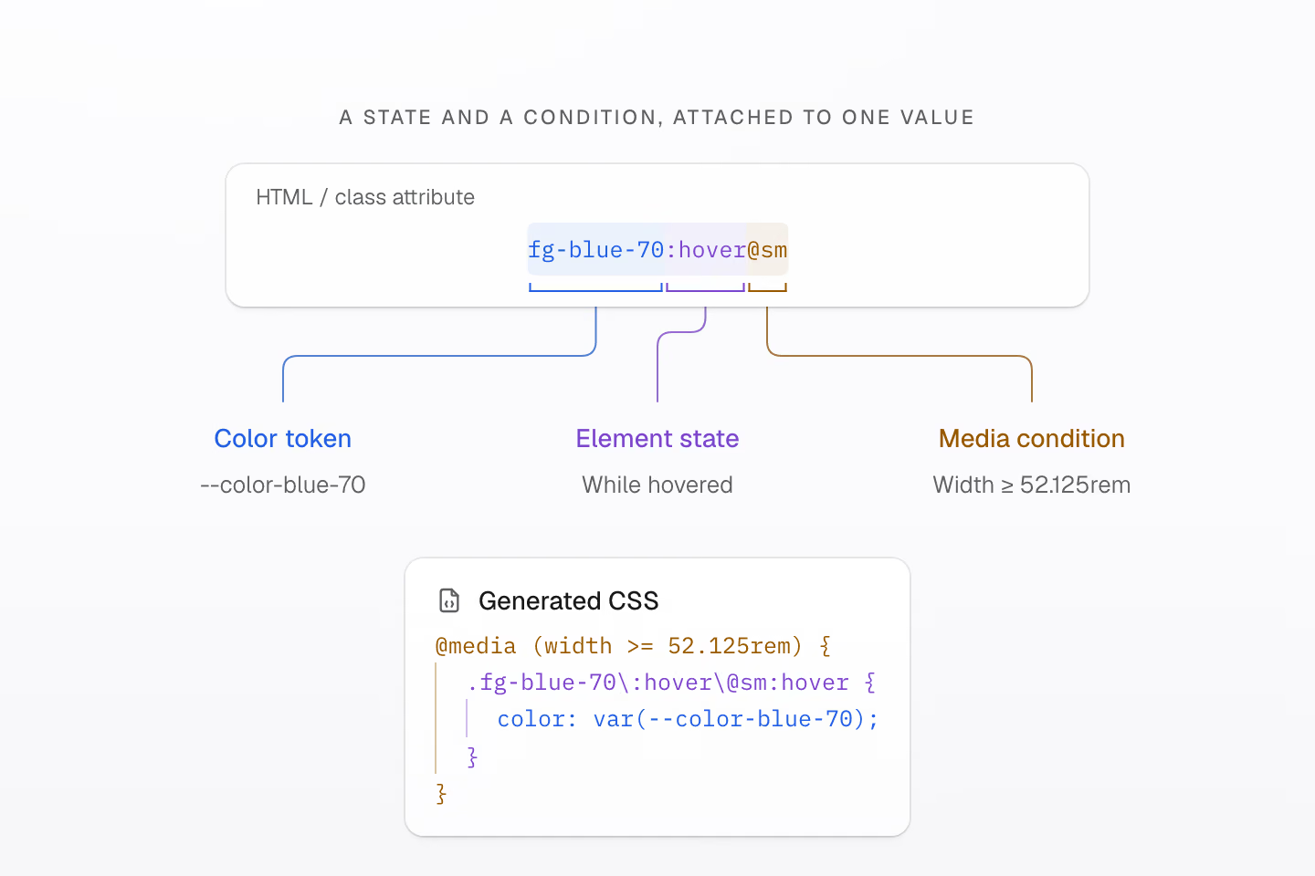
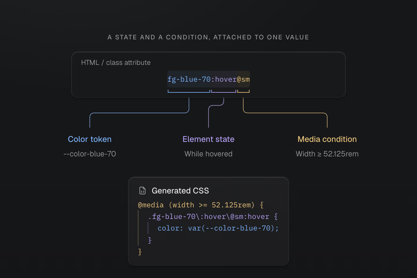
The class keeps the value, selector and condition together. The browser evaluates the generated selector and media query.
Text description
- fg-blue-70 selects color: var(--color-blue-70). :hover attaches the hover state to the element carrying the class.
- @sm uses the preset media condition (width >= 52.125rem). Both the query and hover state must match.
Choose the form that expresses the decision:
| Class | Meaning |
|---|---|
p-lg | Padding from the --spacing-lg token. |
m(0) | Zero margin. |
p(16) | 16px padding. |
grow(1) | A unitless flex growth factor of 1. |
grid-cols(3) | Three equal grid columns. |
(aspect-ratio:4/3) | A native CSS property and value. |
A numeric function follows its property: p(16) is a length; grow(1) is unitless. Native declarations also accept CSS functions and custom properties. With (width:var(--progress)), JavaScript can update the value while the class stays fixed.
More ways to compose a class
| Class | Meaning |
|---|---|
fg-blue-60/.5 · -mt-sm | 50% color opacity, or a negative spacing token. |
fg-blue-60:hover>a · fg-blue-60_a | Direct child links when their parent is hovered, or descendant links. |
grid@supports(display:grid) | A native feature query around the rule. |
(opacity:0)@starting-style | Starting opacity for a CSS transition. |
p-md! | An important padding declaration. |
Selectors such as :focus-visible, :has() and ::before compose with @media(...), @supports(...) and @container(...). Multiple conditions nest, so each must match. The result remains ordinary CSS you can inspect.
The Syntax tutorial is a hands-on place to begin.
#A design system of your own
Start with the preset’s colors, spacing, typography, radii, shadows and motion tokens. As your interface develops its own character, give those decisions names with @theme.
#A wide-gamut color palette
Seventeen hue families, eleven shades each. The preset uses OKLCH, with colors that extend beyond sRGB into the Display P3 gamut. Each column runs from light to dark; the visible range depends on your display.
Use a shade directly with fg-blue-50 or bg-green-90, or define a semantic name. Fieldwork shares an accent and a story inset. Add these definitions after @import '@master/css' in the app stylesheet:
A field note, in your colors
@theme { --color-brand: light-dark(#665442, #d7c2a6); --spacing-story: 1.5rem;}<article class="max-w-sm mx-auto overflow-hidden r-lg bg-surface-raised shadow-sm"> <div class="grid gap-sm p-story"> <p class="m(0) text-xs fg-brand">Fieldwork / Issue 04</p> <h2 class="m(0) text-2xl font-regular fg-text-strong">The everyday, considered.</h2> <p class="m(0) text-sm fg-text-muted">A field note on slowing down, looking closer, and finding a little more in the spaces we inhabit.</p> <details class="text-sm"> <summary class="(cursor:pointer) fg-brand py-xs">Read the field note</summary> <p class="m(0) pt-sm fg-text-body">Morning light moves across the oak table. A cup, a book, a chair pulled close. The room asks for very little, and gives something back: space to read, to think, to begin again. A good home makes room for the everyday.</p> </details> </div></article>Generated CSS
@layer theme { :root, :host { --color-zinc-30: oklch(78% .0025 265); --color-zinc-40: oklch(68.6% .0028 265); --color-zinc-60: oklch(48.6% .003 265); --color-zinc-70: oklch(39.8% .0028 265); --color-zinc-90: oklch(24.6% .0022 265); --color-zinc-100: oklch(15% .0016 265) } :root, :host { --color-surface-raised: light-dark(var(--color-white), var(--color-zinc-90)); --color-text-body: light-dark(var(--color-zinc-70), var(--color-zinc-30)); --color-text-strong: light-dark(var(--color-zinc-100), var(--color-white)); --color-text-muted: light-dark(var(--color-zinc-60), var(--color-zinc-40)) } :root, :host { --color-white: oklch(100% 0 none) } :root, :host { --font-weight-regular: 400; --font-size-xs: .75rem; --font-size-sm: .875rem; --font-size-2xl: 1.5rem; --text-xs: var(--font-size-xs); --text-xs--line-height: 1.5; --text-xs--letter-spacing: 0; --text-sm: var(--font-size-sm); --text-sm--line-height: 1.5; --text-sm--letter-spacing: 0; --text-2xl: var(--font-size-2xl); --text-2xl--line-height: 1.35; --text-2xl--letter-spacing: -.015em; --radius-lg: .5rem; --spacing-xs: .5rem; --spacing-sm: .75rem; --container-sm: 24rem } :root, :host { --shadow-sm: 0 0 0 1px light-dark(oklch(0% 0 none / .04), oklch(100% 0 none / .05)), 0 1px 1px -.5px light-dark(oklch(0% 0 none / .045), oklch(0% 0 none / .3)), 0 2px 2px -1px light-dark(oklch(0% 0 none / .04), oklch(0% 0 none / .26)), 0 4px 4px -2px light-dark(oklch(0% 0 none / .04), oklch(0% 0 none / .24)) } :root, :host { --color-brand: light-dark(#665442, #d7c2a6); --spacing-story: 1.5rem }}@layer utilities { .text-2xl { font-size: var(--text-2xl); line-height: var(--text-2xl--line-height, normal); letter-spacing: var(--text-2xl--letter-spacing, normal) } .text-sm { font-size: var(--text-sm); line-height: var(--text-sm--line-height, normal); letter-spacing: var(--text-sm--letter-spacing, normal) } .text-xs { font-size: var(--text-xs); line-height: var(--text-xs--line-height, normal); letter-spacing: var(--text-xs--letter-spacing, normal) } .bg-surface-raised { background-color: var(--color-surface-raised) } .r-lg { border-radius: var(--radius-lg) } .shadow-sm { box-shadow: var(--shadow-sm) } .fg-brand { color: var(--color-brand) } .fg-text-body { color: var(--color-text-body) } .fg-text-muted { color: var(--color-text-muted) } .fg-text-strong { color: var(--color-text-strong) } .grid { display: grid } .font-regular { font-weight: var(--font-weight-regular) } .gap-sm { gap: var(--spacing-sm) } .m\(0\) { margin: calc(0 * 1px) } .mx-auto { margin-inline: auto } .max-w-sm { max-width: var(--container-sm) } .overflow-hidden { overflow: hidden } .p-story { padding: var(--spacing-story) } .py-xs { padding-block: var(--spacing-xs) } .pt-sm { padding-top: var(--spacing-sm) } .\(cursor\:pointer\) { cursor: pointer }}fg-brand reads --color-brand; p-story reads --spacing-story. Change one token to update every element that uses it. Below, the accent changes between schemes while both cards keep the same 1.5rem inset.
Shared tokens, two color schemes
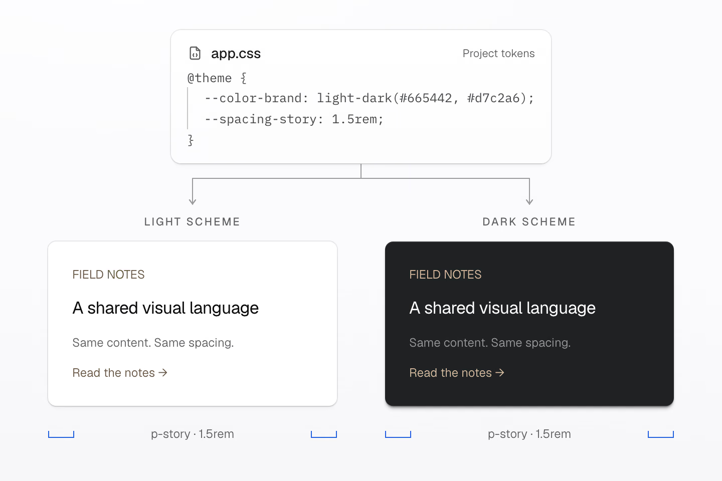
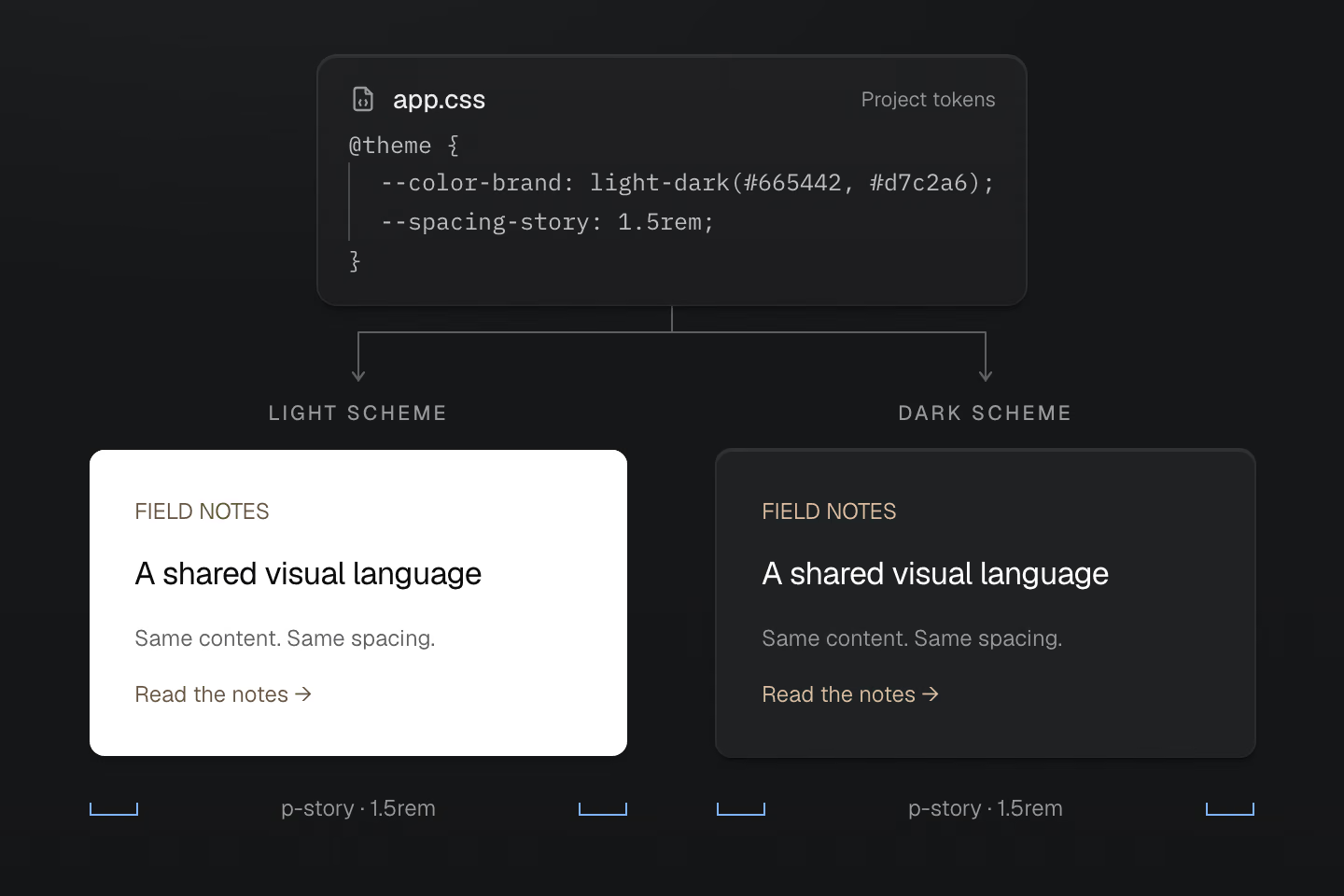
Both cards use the same markup. Native light-dark() selects the accent value; the inspection rulers show the same 1.5rem content inset from p-story.
Text description
- The stylesheet defines --color-brand as light-dark(#665442, #d7c2a6) and --spacing-story as 1.5rem.
- The two text-only panels use fg-brand and p-story. The light panel uses the first accent; the dark panel uses the second. Both keep identical text, layout and 1.5rem padding.
Native light-dark() selects the accent for the active color-scheme. The preset’s semantic surface and text colors follow that scheme too. Name tokens for decisions that should change together, rather than values that happen to match today.
#Name your responsive conditions
Name a viewport condition with @custom-media, or a container condition with @custom-container:
@custom-media --reading (width >= 60rem);@custom-container --story-wide (width >=28rem);<section class="container-inline (container-name:story)"> <article class="grid gap-md p-md p-lg@reading grid-cols(2)@container(story_--story-wide)"> <h2 class="m(0)">A layout that knows its space</h2> <p class="m(0)">Two columns when this container has room.</p> </article></section>Generated CSS
@layer theme { :root, :host { --spacing-md: 1rem; --spacing-lg: 1.5rem }}@layer utilities { .container-inline { container-type: inline-size } .grid { display: grid } .gap-md { gap: var(--spacing-md) } .m\(0\) { margin: calc(0 * 1px) } .p-md { padding: var(--spacing-md) } .\(container-name\:story\) { container-name: story } @container story (width >= 28rem) { .grid-cols\(2\)\@container\(story_--story-wide\) { display: grid; grid-template-columns: repeat(2, minmax(0, 1fr)) } } @media (width >= 60rem) { .p-lg\@reading { padding: var(--spacing-lg) } }}p-lg@reading follows the viewport; grid-cols(2)@container(story_--story-wide) follows the parent’s named story container. One responds to the page’s width, the other to the component’s available space. In a class, _ writes the space inside a value or query, so @container(story_--story-wide) measures the story container against --story-wide; write \_ for a literal underscore. In your app stylesheet, write the same conditions as @media (--reading) and @container story (--story-wide). Master CSS expands both forms to ordinary CSS queries.
Theme tokens and Color show how to shape the foundation around your own work.
#Native CSS, reusable patterns
A story link, navigation item or dialog can have its own CSS. The preset establishes five cascade layers: theme, base, defaults, components and utilities. Put the shared pattern in components; use a utility for a local adjustment.
@layer components { .story-link { display: inline-flex; padding-inline: 1rem; padding-block: 0.5rem; border-radius: 0.375rem; background-color: var(--color-surface-raised); color: var(--color-text-body); text-decoration: none; }}<a class="story-link" href="/journal">Read the journal</a><a class="story-link px-lg" href="/journal">Read the journal</a>Generated CSS
@layer components { .story-link { background-color: var(--color-surface-raised); color: var(--color-text-body); border-radius: .375rem; padding-block: .5rem; padding-inline: 1rem; text-decoration: none; display: inline-flex; }}@layer theme { :root, :host { --color-zinc-30: oklch(78% .0025 265); --color-zinc-70: oklch(39.8% .0028 265); --color-zinc-90: oklch(24.6% .0022 265) } :root, :host { --color-surface-raised: light-dark(var(--color-white), var(--color-zinc-90)); --color-text-body: light-dark(var(--color-zinc-70), var(--color-zinc-30)) } :root, :host { --color-white: oklch(100% 0 none) } :root, :host { --spacing-lg: 1.5rem }}@layer utilities { .px-lg { padding-inline: var(--spacing-lg) }}Both links share .story-link. The second adds px-lg, increasing its horizontal padding from 1rem to 1.5rem. For normal declarations, the later utilities layer takes precedence over components.
A shared component, a local choice
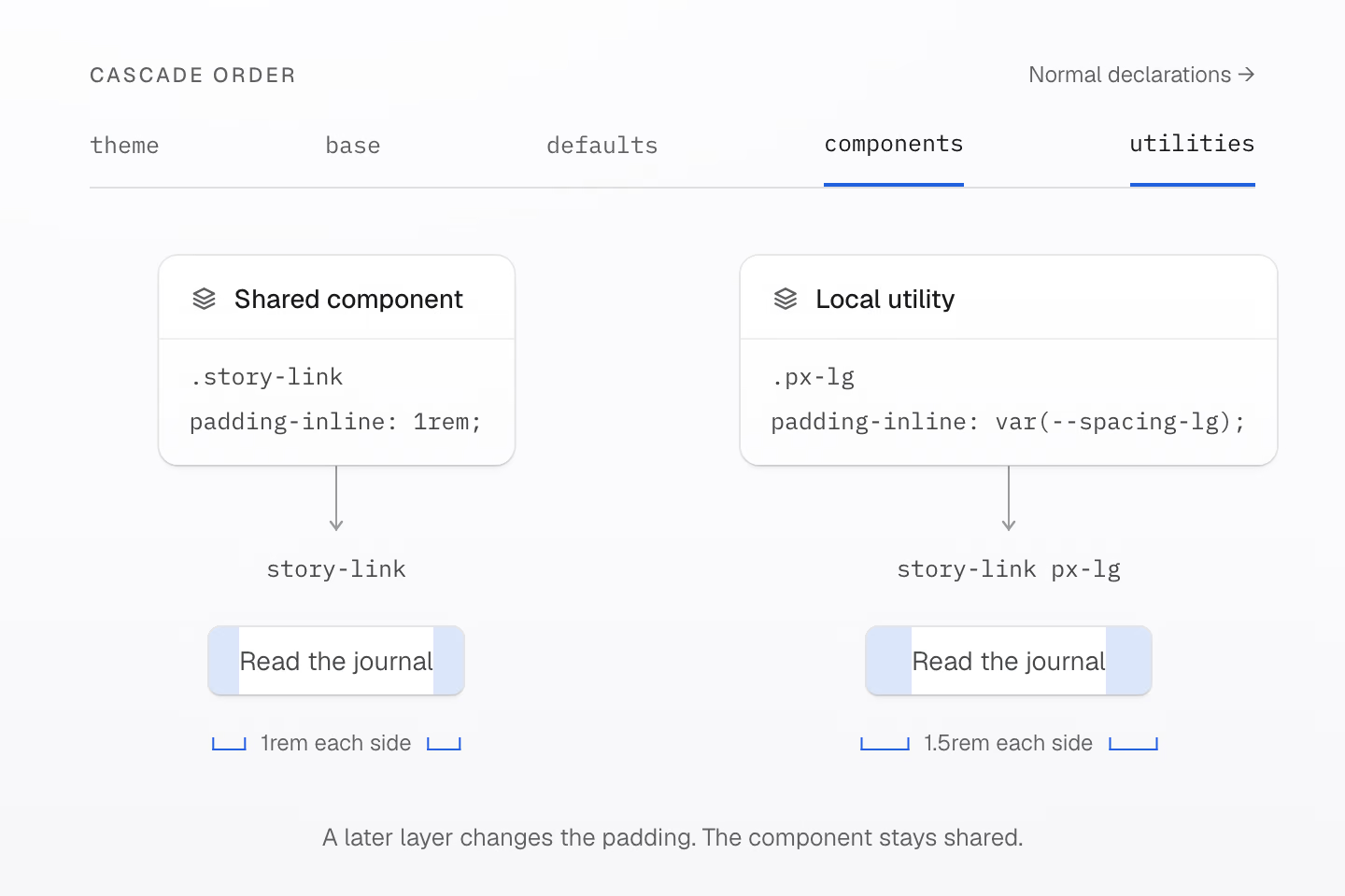
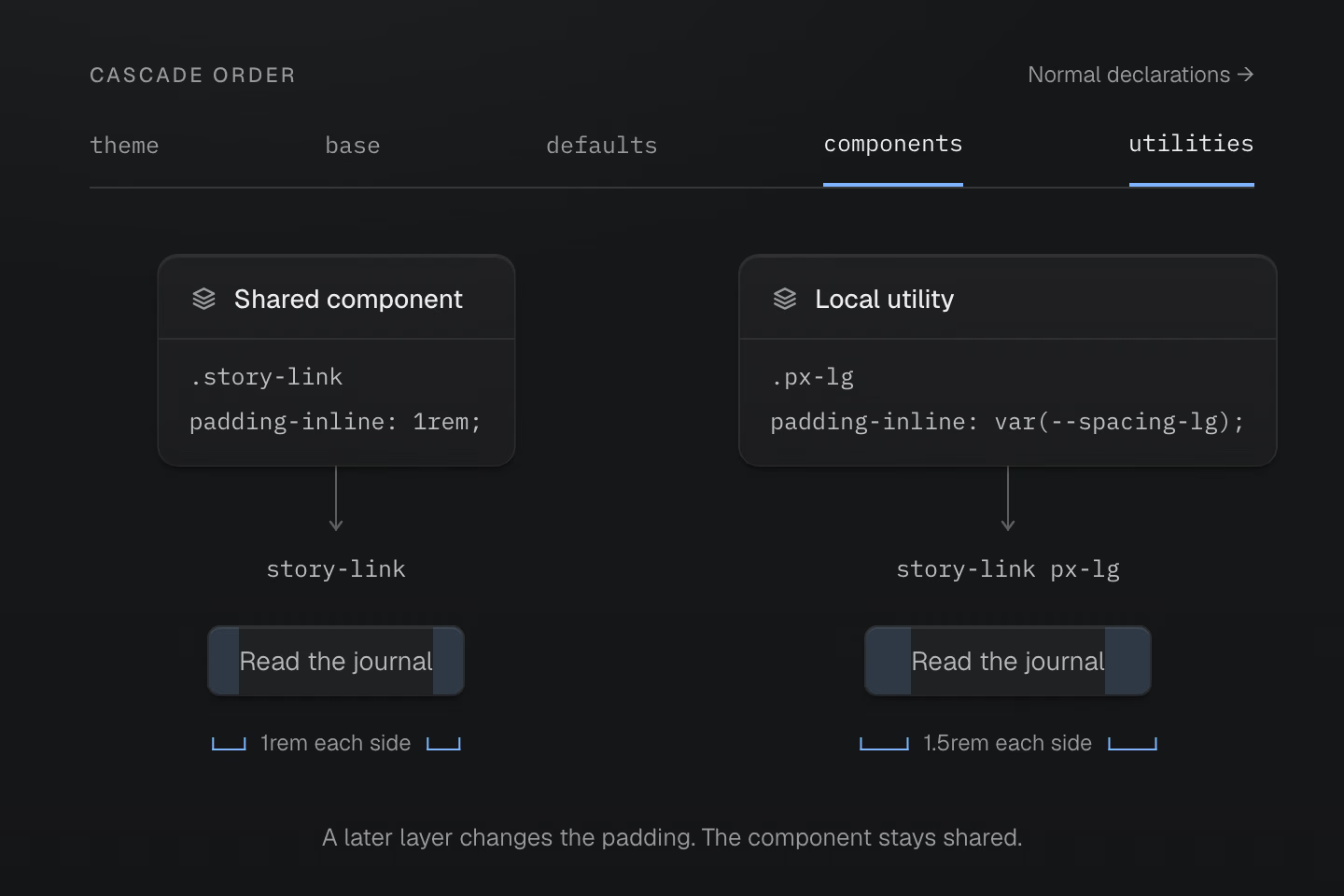
For normal declarations in these layers, utilities take precedence over components. Blue bands are padding inspection guides, not the component’s background.
Text description
- The .story-link component defines 1rem horizontal padding in the components layer. Both links inherit its shape and typography.
- The second link adds px-lg from the utilities layer. Its padding becomes 1.5rem on each side; the link text is unchanged.
#Choose what to reuse
Different kinds of reuse deserve different tools:
| Share… | With |
|---|---|
| Design values | Tokens in @theme. |
| Component styles | A native class in @layer components. |
| On-demand classes | An @utility definition. |
| Declarations and conditions | @mixin definitions expanded by @apply. |
A mixin does not create a class. Here, --action-row supplies the same declarations to a native component and an on-demand utility:
@mixin --action-row { display: inline-flex; align-items: center; gap: var(--spacing-xs);}@utility action-row { @apply --action-row;}@mixin --hocus { &:is(:hover, :focus-visible) { @contents; }}@layer components { .story-action { @apply --action-row; }}<a class="story-action underline@apply(--hocus)" href="/journal">Read a story</a><a class="action-row underline@apply(--hocus)" href="/archive">Browse the archive</a>Generated CSS
@layer components { .story-action { display: inline-flex; align-items: center; gap: var(--spacing-xs) }}@layer theme { :root, :host { --spacing-xs: .5rem }}@layer utilities { .action-row { display: inline-flex; align-items: center; gap: var(--spacing-xs) } .underline\@apply\(--hocus\):is(:hover, :focus-visible) { text-decoration-line: underline }}--hocus shares the selector for hover and keyboard focus. Its @contents slot receives the underline from underline@apply(--hocus). @apply takes a mixin call, not a list of utility classes. Master compiles its supported static mixin syntax; native browser support for CSS mixins is not required.
Custom utilities can also accept static parameters or connect a token namespace to a class family. Your project’s vocabulary becomes available to the compiler and tooling alongside the preset.
See Reusing styles for these patterns and Cascade layers for ordering, including important declarations and unlayered styles.
#Choose how to deliver CSS
Choose a rendering mode by when your application knows its class names.
Static is the default. Scan complete class names at build time and deliver a stylesheet. The browser needs no Master CSS runtime.
prerender ships generated CSS with the HTML. Use it when your integration can read the finished HTML and that HTML contains every class the page will need. The browser needs no Master CSS runtime.
Runtime generates CSS in the browser. Use it when editors, playgrounds or deployed content can introduce class names that were unknown at build time. Both runtime and progressive modes include browser JavaScript.
Progressive starts with rendered HTML. Deliver its initial CSS, then generate rules in the browser for uncovered classes that appear later. With valid pre-rendered CSS and a hydration manifest, the default runtime can defer its engine until that happens.
The same authoring model, four delivery paths
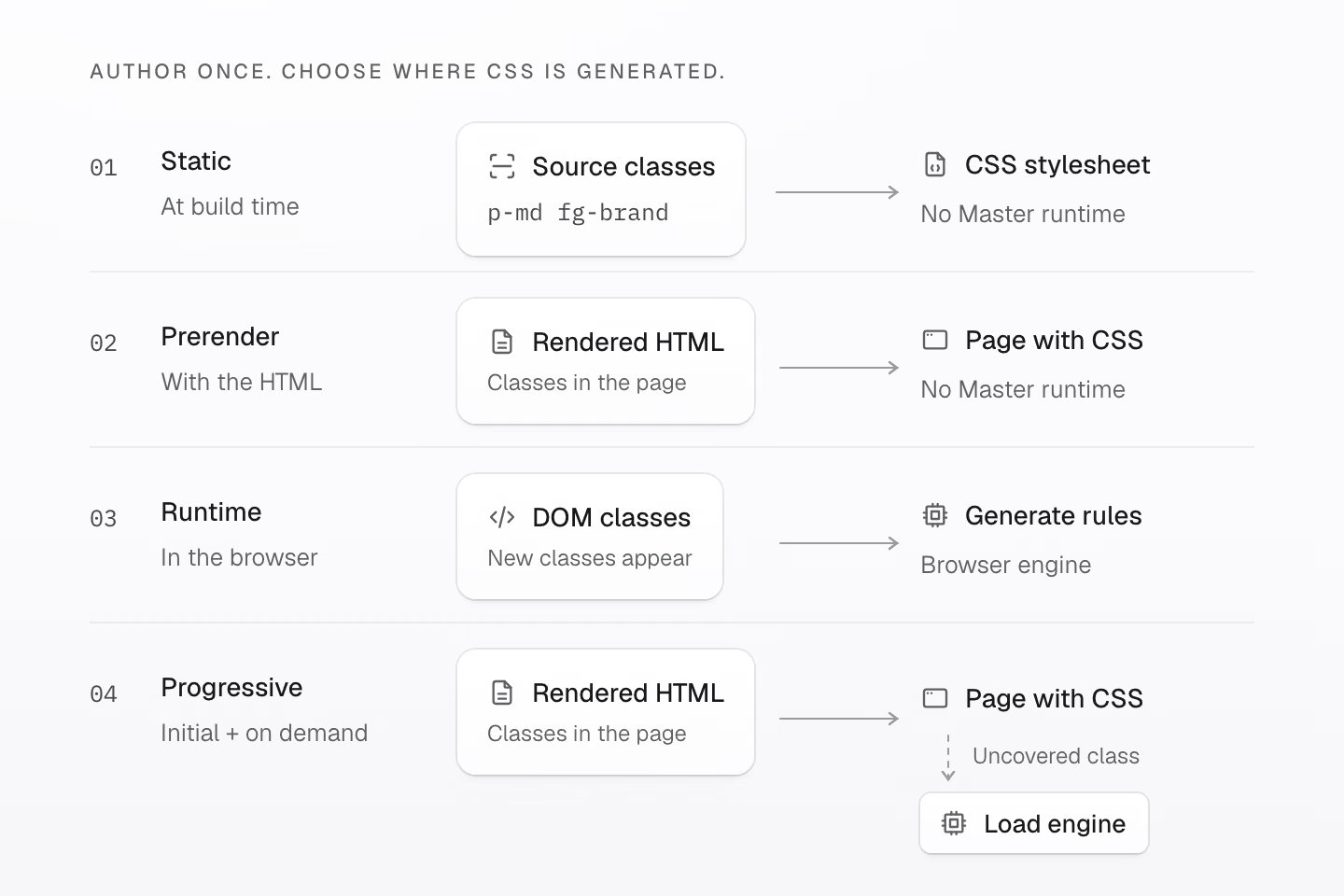
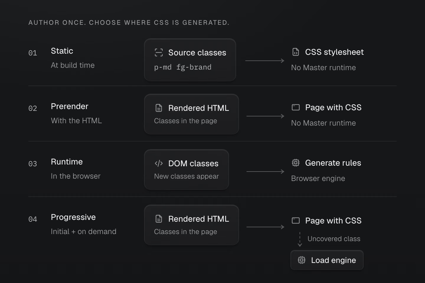
Each path is a separate choice. Progressive delivery can defer the engine when hydration data is valid.
Text description
- Static scans complete source classes at build time. The browser receives a CSS stylesheet without a Master CSS runtime.
- Prerender generates CSS from the rendered HTML and ships it with that HTML. The browser needs no Master CSS runtime.
- Runtime uses classes on connected DOM elements to generate CSS in the browser, including classes introduced later.
- Progressive delivers initial CSS from rendered HTML. With a valid stylesheet and page manifest, the default runtime loads its engine when an uncovered class appears.
Fieldwork can use static rendering and still expand stories, respond to media queries and switch themes. Interactivity alone does not require runtime CSS generation.
Rendering boundaries to keep in view
The CLI and Vite production build fold eligible local imports into their generated CSS output. Deploy the complete asset set so any retained stylesheets, fonts and images are available too.
The Next.js progressive adapter processes HTML produced at build time. Dynamic request-time SSR responses rely on the browser runtime in this mode.
Source scanning does not evaluate arbitrary string interpolation. See Rendering modes for adapter boundaries and response checks.
Rust owns the core semantics. A JavaScript engine executes compiled programs in the browser and is checked against Rust for matching output.
Control scanning, shared definitions and pruning
| Directive | Purpose |
|---|---|
@source / @source not | Add or exclude source files to scan. |
@safelist / @blocklist | Retain or exclude class candidates. |
@reference | Share definitions without importing the referenced file’s native CSS. |
@prune native | Opt a file’s native styles and managed keyframes into removal when the build supplies class usage. |
Native styles are preserved by default. Scanning and pruning explains how to make those boundaries explicit.
#Measure the CSS you ship
The Master CSS guide in the v2.0.0 production build contains 24.5 kB with Brotli · 110.4 kB raw across its inline styles and linked stylesheets. The linked files, which include styles for the site’s own components, account for most of that CSS. The page’s generated style#master-css block accounts for 833 bytes before compression.
CSS delivered by documentation pages
7 documentation pages · CSS in kB
 Master CSS
 Angular
 Vue.js
 Material UI
 Bootstrap
 Next.js
 Tailwind CSSAngularMaster CSSMaterial UIBootstrapVue.jsTailwind CSSNext.js
Each page has its own design, content and build pipeline. The chart counts inline styles and the stylesheets linked by the initial HTML; it does not measure network transfer or framework performance. For a controlled comparison, see the same UI built with Master CSS and Tailwind CSS.
#Tools that know your project
The language service reads your project’s definitions. Complete a token name, inspect generated CSS on hover, and work with colors in the editor. Custom utilities and tokens belong to that context too.
#See a class at a glance
In the VS Code extension’s default active mode, semantic highlighting follows the class context at the cursor. Values, selectors, queries, units and important markers become distinguishable while surrounding markup stays quiet.
Read the parts of a class
<h2 class="m(0) text-lg">Field notes</h2><a class="fg-blue-70:hover@sm" href="/journal"> Read the journal</a>Hover or Tab into a class value to reveal its syntax colors. Touch devices show them directly. This web demo uses Master CSS semantic analysis; VS Code follows the editor cursor.
What the colors describe
The first class list contains the numeric function m(0) and the text-lg token utility. The second combines fg-blue-70, the :hover selector and the @sm media condition. Highlighting distinguishes these parts without changing the generated CSS.
Choose the editor’s highlighting mode
Set masterCSS.embeddedSyntaxHighlighting to active for the cursor’s class context, always for every discovered embedded utility, or off to disable embedded utility highlighting. CSS directive syntax stays highlighted. The active VS Code theme must enable semantic highlighting.
#Catch mistakes with code linting
The ESLint integration checks classes against your project. Its recommended config enables these four rules. Rule names use the @master/css/ prefix.
| Rule | Purpose |
|---|---|
sort-classes | Keep class order consistent and remove duplicates. |
no-invalid-classes | Catch malformed syntax and invalid generated CSS. |
no-conflicting-classes | Report declaration overlaps in the same variant scope. |
prefer-canonical-classes | Prefer equivalent forms that preserve meaning and ordering. |
Two additional rules are opt-in:
| Rule | Team policy |
|---|---|
no-unapproved-raw-values | Require tokens or explicit exceptions for raw values in token-backed classes. |
prefer-component-classes | Suggest a component for large groups of combinator classes. |
Autofix handles ordering, canonical replacements and fully overridden classes. Unknown class names are ignored by default; raw-value and component policies need an author’s decision.
From conflict to safe fix
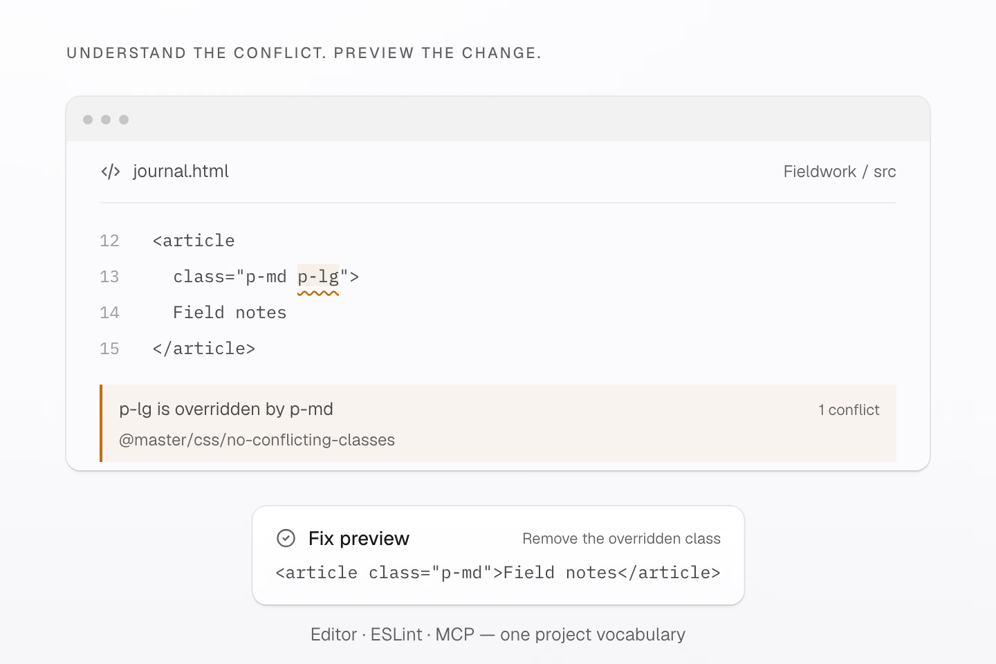
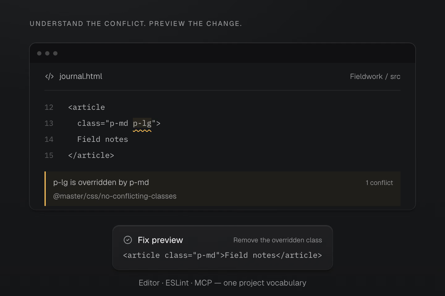
Generated CSS makes p-md the winner. The safe fix removes p-lg and preserves the result.
Text description
- For <article class="p-md p-lg">Field notes</article>, the conflict diagnostic reports: Remove class "p-lg"; it is overridden by class "p-md" in generated CSS.
- The safe fix produces <article class="p-md">Field notes</article>. The editor, lint tools and MCP consult the project’s resolved definitions; applying a preview also checks the source file hashes.
For p-md p-lg, the tooling reports p-lg as overridden and keeps p-md. HTML class order does not decide CSS precedence. Partial overlaps still need review, and a clean lint result does not prove browser support or visual correctness. See Code linting for setup and rule options.
#Give AI your project context
The local Master CSS MCP server gives coding agents the same project context: query tokens and utilities, inspect generated CSS, run lint checks and preview fixes. Applying a preview checks that the affected files still match the source it was prepared against.
Your project vocabulary, across AI tools
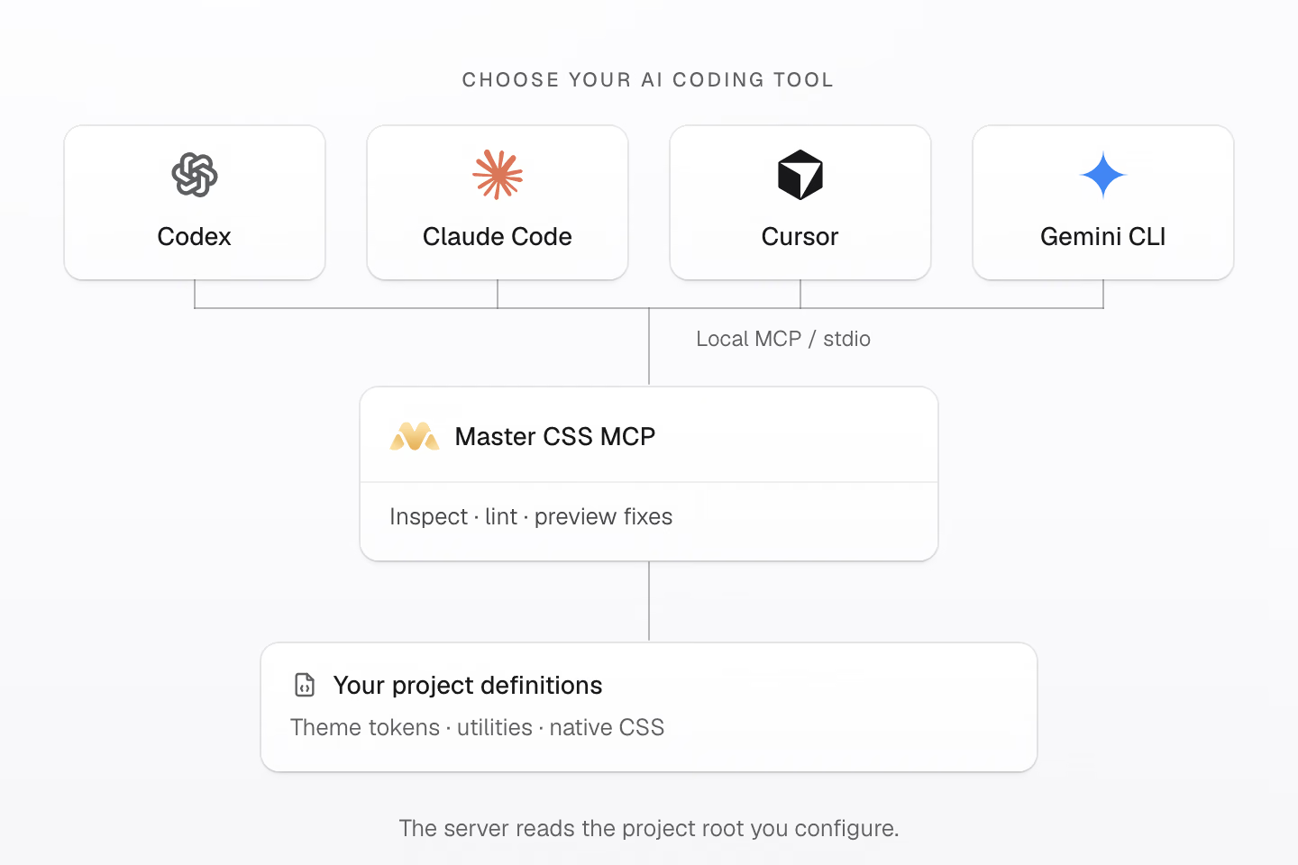
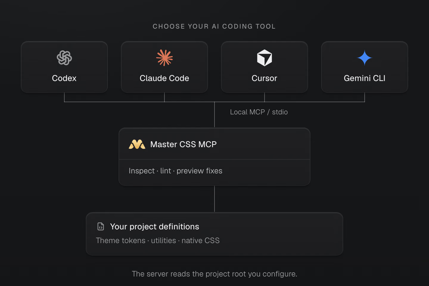
Connect your AI client over local stdio. The server reads the project root you configure.
Text description
- Codex, Claude Code, Cursor and Gemini CLI are alternative MCP clients. Configure the Master CSS server with the root of the project each client should inspect.
- Master CSS MCP exposes manifest queries, generated CSS inspection, lint diagnostics and fix previews from the loaded project context.
- Theme tokens, utilities and native CSS remain in the project. Applying a fix preview checks source hashes; the client controls tool permissions.
Connect a client with local stdio MCP support, such as Codex, Claude Code, Cursor or Gemini CLI. Configure the project root and confirm the loaded workspace; the client controls tool permissions.
See Language service and AI coding workflow to bring that context into your editor and agent.
#Make something that feels like yours
Start with one component. Add a state, name a shared value, and inspect the result. Let the next real need tell you what to make reusable.
Thank you to everyone who tested Master CSS, reported a problem or shared what you built. You helped shape 2.0.
Install Master CSS, then build your first interface with the Syntax tutorial.
If Master CSS helps your work, star it on GitHub so more developers can find it.